Every old-timer lives for the day when someone will ask about the good old days.
I need to start back in the mists. Even the early pioneers in seismics saw that there must be more to the seismic waveform than travel time. After the important clarifications given by Norman Ricker, the waveform attribute that intrigued us most was frequency content. When magnetic recording became available, in about 1954, the main reason for adopting it was seen as its ability to provide frequency analysis. Only after a year or two did a more powerful reason emerge: reproducible recording enabled the plotting of corrected cross-sections.
To the geophysicist of today, it must seem beyond belief that the seismic method was practised for nearly 30 years before the results were routinely presented in the form of a corrected cross-section. (The great Frank Rieber had played with the idea, but discarded it as unhelpful.) When the cross-section finally came, seismics was transformed. Refraction was out, reflection was in. Crucially, even geologists were convinced; now they could actually see down into the earth. And this addition of instant geological meaning provided a new criterion — geological plausibility — for distinguishing signal from noise; those wiggles that were compatible with a geological origin were signal, and those that were not were noise.
To me, the corrected cross-sectional display remains the most important single development in the history of seismics.
By the mid-1960s the technology for plotting good-quality cross-sections was well established. And the digital revolution was yielding new goodies every month. However, it was still true that no real benefit had been shown from studies of frequency content.
Also in the mid-1960s—particularly after contributions from Milo Backus and Bill Schneider, and the development of the velocity spectrum by Tury Taner and Fulton Koehler — multi-fold data began to ease the calculation of interval velocities. In the context of Ray Petersen’s synthetic seismogram (1955), and its implied convolutional model, the interval velocity is arguably the most fundamental of attributes. But the scatter in the interval-velocity values was enormous; was it possible that one might be able to see a message through the scatter if the data could be presented in cross-sectional form?
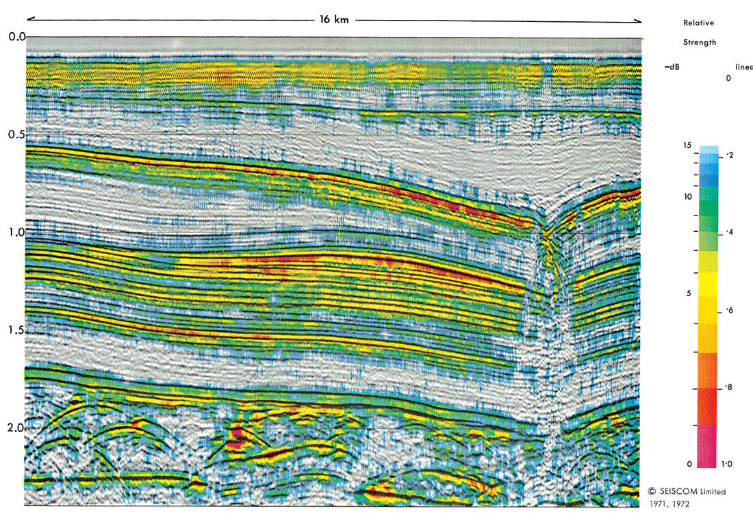
During the late 1960s it became clear that some companies operating in the Gulf of Mexico were offering anomalous bonus bids — suggesting that they had some ‘extra’ technology. This, as it emerged, was the technology of bright spots: if one used less agc, and plotted at reduced gain, one could see zones of very large amplitude that could be linked to the presence of gas. However, the display at small gain lost most of the structural detail from the display, so it was necessary to plot two sections — the bright-spot section and the conventional section. This had the disadvantage that, in the interpretation of bright spots, the criterion of geological plausibility was made less direct, and therefore weakened.
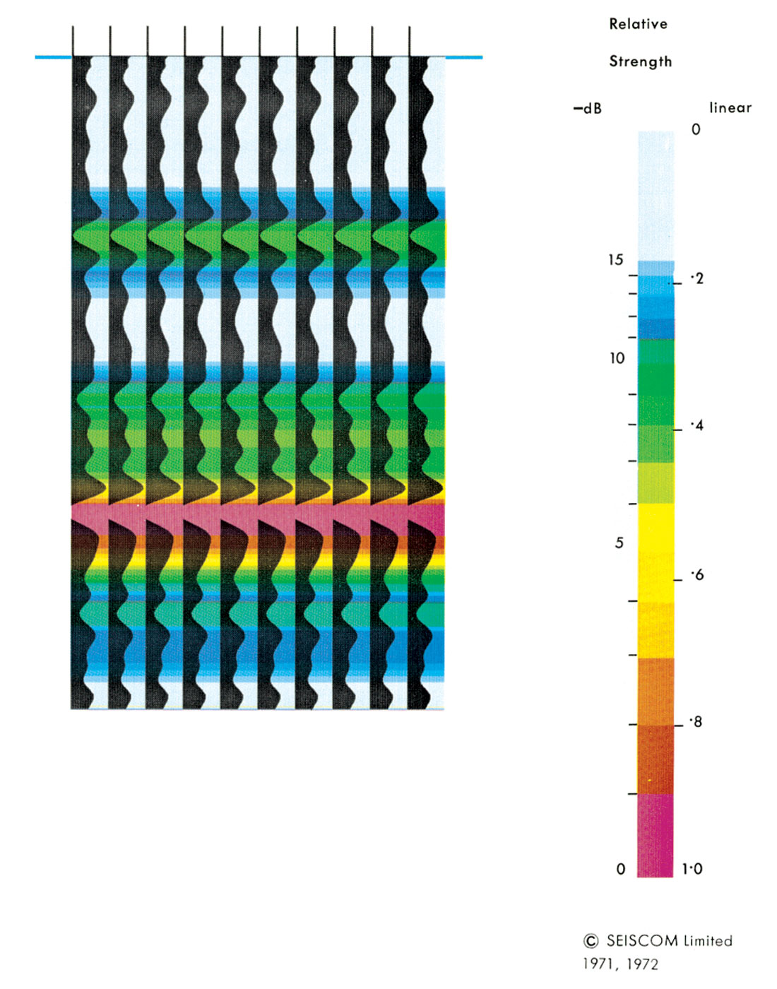
Thus, by the time that Seiscom Limited was set up in the UK in 1968/9, it was evident to us that there should be benefit in displaying two variables on the seismic section: the normal trace to give the geological picture, and an auxiliary modulation to show interval velocity, or reflection amplitude, or frequency content, or anything else that might prove useful. By good chance, SIE had just developed its first laser plotter, which could plot both variable-area and variable-density (in dot form, on black-and-white film) over a wide range of scales. Seiscom management swallowed hard when they were told the price, but were persuaded.
Although some encouraging experiments were done with a density modulation on the usual variable-area, it was always clear that the right way to go was color. The dynamic range available for the auxiliary modulation would be much larger, and the interpretation of the color could be made quantitative by adding a color key. With the help of Ron O’Doherty (who did the programming) and Peter Ferrer (who beat the plotter into shape), the techniques for making and printing color-separation films were developed during 1969 and 1970, and by 1971 we were making reflection-strength and interval-velocity displays of commercial quality.
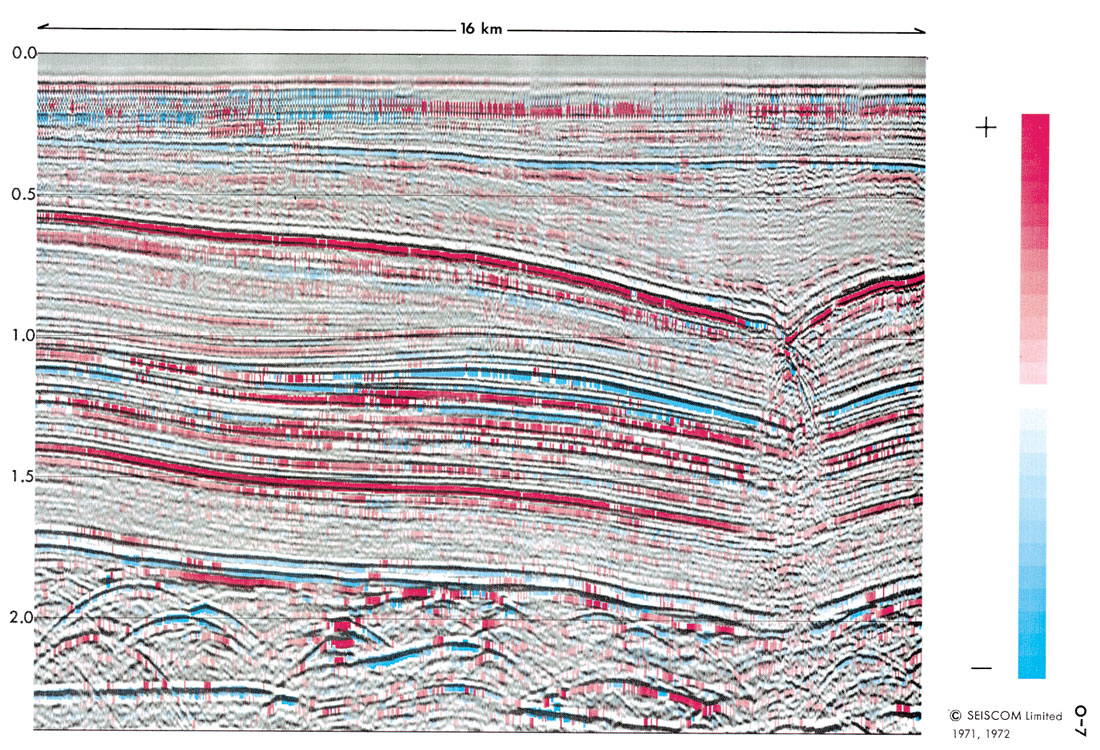
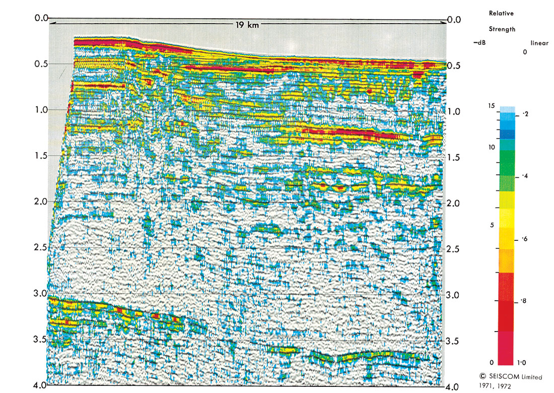
The first client to commission such work was Chevron, and interval-velocity displays prepared for them were exhibited at the SEG convention in 1972. A few other companies (including some famous names) were totally dismissive. “A pretty gimmick.” No hard feelings; we have all learned to be on guard against gimmickry — even in geophysics — and some saw the color as mere prettiness. But it was not. The real advance lay in the simultaneous display of an attribute in its geological context. The color was just a way of doing this — not only with enlarged and quantitative dynamic range, but also with instant communication between eye and brain.
The simultaneous display of two variables allowed different processing on the two data streams; the conventional black-and-white section underlying the display could be processed ‘cosmetically’ — by any means that clarified the geology — while the color modulation could represent ‘the truth’. In bright-spot work, for example, the underlying section could be filtered and amplitude-equalized at will, for visual clarity, while the superposed color could represent broader-band true-amplitude data.
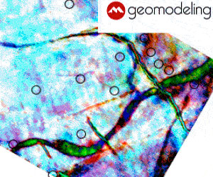
Although the two-variable display could be realized at large scale (usually with the underlying section in black variable-area and the attribute in color, after the style of Figure 1) the preferred display proved to be in ‘squash-plot’ form, with the horizontal scale compressed. The traces then became very narrow, so that the best way of displaying the underlying section was in black variable-density.
Originally the underlying section was plotted as one black-and-white photographic film, and the color modulation as three black-and- white color-separation films. These were then printed photographically, with appropriate color filters. Almost immediately, these techniques were replaced by the commercial Cromalin process. Wholly digital methods, using arrays of primary-color dots and digital plotters, were developed by Clyde Hubbard, Emmett Klein and Mike Castelberg in 1974.
The simultaneous display of two seismic variables, in black-and-white and color, was patented by Seiscom in 1971, and the dot-array method in 1974. Both patents expired in the 1990s.
The attributes used as examples in the 1971 patent were interval velocity, reflection strength, coherence and cross-dip. These were soon supplemented by apparent polarity, synthetic reflection strength (from the logs and the interval velocities), and the rate of change of frequency content; much of the programming on these was done by Judy Farrell. Some examples are given in Figures 2-7. Frequency content itself was also implemented, though at that stage of our thinking — despite independent and insightful work by Karl Heinz and Al Balch — it remained disappointing as an aid to interpretation.

At the time, most seismic work was still in 2-D. The third dimension was included in the displays, to the extent possible, by the preparation of isometric fence-diagrams in color (Figure 8); much of the programming of this was done by Lloyd Chapman. The displays could be rotated to optimize the view, ‘sculpted’ down to reservoir level, and supplemented by a superposed contour map.
We also explored color as a means of cross-plotting two or more attributes. We saw the primary application of this in the display of well logs at seismic scale. Each of three different logs was converted to a variable-density bar in a primary color, and the three were superposed; particular relations between the three logs then emerged as particular mixed colors. To a seismic eye, the result was intriguing. It was submitted to a leading well-logging company, who expressed no interest at all; this seemed a strange decision at the time, and it still does. Anyway, it sent us scurrying back to seismics.

During the early years, I for one did not think in terms of the complex seismic trace. Although the 1971 patent mentioned a measure of reflection strength derived by summing the kinetic and potential energies of the trace, the measure we actually used was obtained by rectifying the trace and smoothing it, in time-honored analog fashion. Polarity was estimated from the position of the largest extremum relative to the peak of reflection strength. Frequency content was judged from narrow filters and the spacing of zero- crossings. And the underlying section was trimmed with a short agc. It was just a start.
I left Seiscom in 1975, and sharper minds than mine took over. Tury Taner and Bob Sheriff quickly saw the merit of the complex-trace approach through the Hilbert transform: reflection strength became calculable without the need for smoothing, the short-agc section could be replaced by a plot of the cosine of the phase angle, and instantaneous frequency emerged as the rate of change of phase. Wonderful. Their 1977 paper in the famous AAPG Memoir 26 was based on these insights. It properly acknowledged the contribution of Fulton Koehler, and the 1979 follow-up paper in Geophysics properly added the contribution of Ron O’Doherty.

The reason that no earlier accounts exist was simply that the professional journals could not handle color displays at the time. In 1973 I presented a paper “The significance of color displays in the identification of gas accumulations” to the SEG and the AAPG and the EAEG; this was well received, but there was no economic way to get general publication. Therefore, for limited circulation among Seiscom’s clients, we prepared full-color technical accounts of the available displays in 1972 and 1973; these are the Seiscom ’72 and Seiscom ’73 referred to in the 1979 Geophysics paper, and the source of most of the figures in the present notes.
Satinder Chopra, in soliciting these notes, asked what I thought of the proliferation of attributes now available. Sometimes our science is driven by theory, which then demands an experiment; there could not be a better example than deconvolution. ( Visualize Enders Robinson, all fired up by the theory, settling down to spend the whole summer of 1953 digitizing a seismic record by hand, to test whether decon worked.) And sometimes it is driven by data, which then demands a theory; there could not be a better example than the early well logs. (“If the wiggles look significant, carry on … we’ll work out why as we get more data.”) So let the ideas come. Prefer those that have both a geological and a physical rationale. Accept that some problems must require several inputs; we cannot expect porosity, for example, to be determinable from one geophysical variable, and possibly not from two. Find ways (like the neural approaches) to combine several messages. And do not forget the importance of display, in getting the message through the eye to the brain.
Even frequency content — so long a disappointment — is set fair to become useful. We understand better the many factors influencing it. We see how to divide them, and to conquer them. And we see the objective: if we can strip out the irrelevancies, the frequency content contains the thickness, and the thickness contains the sedimentation rate and the depositional environment, through the tie to the sea-level charts and to geologic time. Reflection time contains the tectonics; reflection strength contains the physics; but frequency contains the sedimentation. It is a tough nut, but someone will crack it.
Though not … forgive me! … not without displaying the results, in color, against a background of the geological context.


Join the Conversation
Interested in starting, or contributing to a conversation about an article or issue of the RECORDER? Join our CSEG LinkedIn Group.
Share This Article