Summary
When writing a paper, convention dictates that you begin with a summary, a concise outline of the subjects that you will cover in more detail in the body of the article. This paper is different because it is itself a summary being little more than an overview to an introduction. To make any point I have to touch on many points, too many to cover in detail. The details will follow in subsequent papers. The purpose of this paper is simply to lay the groundwork for them. Consider it an extended abstract.
The paper also differs in style from what one would normally expect in a scientific journal. Again, resorting to convention, when writing scientifically one tries to achieve a state of dispassionate clarity. Dispassionate is not a term that I would use to describe what follows. I could and have written it that way but it did not work. I discovered that to make my points, I had to provide you with an experience and an experience engages far more than your scientific persona.
This is very strange writing for me.
Preface
From the time I have been a small boy, I have begun everything I write with some sort of poetry. I am not sure why because I am not particularly artistic; it just seems to work for me. I began the third section of my PhD. thesis with the following poem. It seemed to fit there and it seems to fit here but in all honesty, I can’t put into words the reasons why.
When Earth’s last picture is painted and the tubes are twisted and dried, When the oldest colours have faded, and the youngest critic has died, We shall rest, and, faith we shall need it – lie down for an Æon or two, Till the Master of All Good Workmen shall put us to work anew.
And those that were good shall be happy: they shall sit in a golden chair; They shall splash at a ten-league canvas with brushes of comets’ hair. They shall find real saints to draw from – Magdalene, Peter, and Paul; They shall work for an age at a sitting and never be tired at all.
And only the Master shall praise us, and only the Master shall blame; And no one shall work for money, and no one shall work for fame, But each for the joy of the working, and each, in his separate star, Shall draw the Thing as he sees It for the God of Things as they are!
Introduction
This is the first of a series of papers that evolve out of my PhD thesis, which I completed in 2008 under the direction of my long-time friend and sometimes advisor, Dr. Larry Lines of the University of Calgary. Through these papers I will introduce the reader to both the science of Visual Acoustics and the practice of Wavefield Visualization. Visual Acoustics, as the name suggests, is the science of visually representing an acoustic wavefield, in this case seismic data. Wavefield Visualization is the study of the features that the representations reveal.
Theory and practice; Visual Acoustics is the theory, Wavefield Visualization is the practice. Both are likely to be new to you. I hope at the outset that you find learning about them as fascinating as I found researching them. Studying the theory took me to the very limits of human knowledge and challenged everything I thought I knew about myself, about us, about who and what we are. Investigating the practice took me far beyond the limits of conventional resolution and challenged everything I thought I knew about seismic data.
I have been studying and developing both for over ten years and in that time I have developed certain ideas and principles that the reader may initially find hard to accept. This would seem to be a good time to state the most important one.
Principal Assertion
A seismic section contains an almost limitless amount of information all of which must be communicated to the viewer visually. An interpreter’s ability to make informed decisions rests heavily upon the display’s ability to communicate that information in a compact and meaningful way.
Since the advent of digital signal processing in the late 60’s, we have made great strides in improving seismic resolution and yet, for the past 30 years, our ability to communicate that resolution to the interpreter has remained static.
Today, almost all seismic data is still viewed using the same combination of wiggle trace displays, chromatic variable density displays and achromatic grey scale displays as it was over a generation ago.
It is important to note that these displays were not developed because they were the best way to communicate seismic information but rather, they were developed simply because they were the best way to display seismic data using the technology of the day. That technology is now antiquated.
This acceptance of the visual status quo opens the door to the possibility that the limit of both temporal and spatial resolution is now determined as much by the display and what it can communicate as it is by the spectral balancing and migration applied to the data.
It is my principal assertion that there exists, buried deep within every seismic record and section, entire levels of detail of relevant, coherent signals that lie below the visual resolution of conventional seismic displays.
At first, given its potential implications, this assertion may be hard to accept. If, however, we allow ourselves to believe that it is true then we arrive at two broad and inevitable conclusions:
- Every interpretation that has ever been done was accomplished with the interpreter using only a subset of the available geological information and with having only a vague idea of the effect that noise was having upon the data.
- Because the processor was using the same conventional displays as the interpreter, relevant information was either lost or corrupted during processing simply because the processor was unaware of its existence.
The Journey
What I have just said is that we have, since the dawn of the digital era, discarded much of the resolution that we worked so hard to produce. I do not say that lightly and I hardly expect the reader to accept what I have just said, verbatim. Personally, it was years from the time that I produced my first wavefield display until I finally accepted it myself and acceptance did not come from a single observation or fact; it was a journey, one that I hope to take you on.
One of the difficulties that I faced while preparing this first paper was where to begin. In the end, there was simply no way to begin without stating what I believe I can prove. I believe that we have thrown away so much resolution that every survey acquired since we switched to digital acquisition and processing in the early 70s would benefit significantly by being reprocessed and reinterpreted. I also believe that I will, over time, prove my point but having said that, I recognize that believing me is a big stretch for you at this point in time.
But I am not worried. As I said, accepting it myself was a journey. It was fun the first time when I didn’t know where I was going or what I would find when I got there. It will be even more fun this time now I know the route and have company.
Being Theoretically (but never politically) Correct
Did you hear the one about the geologist, the engineer and the geophysicist …
You can fill in your own joke here. It doesn’t really matter what joke you use, the odds are it will end with the geophysicist smiling and saying “what do you want it to be?” Despite my love of self-deprecating humor, I have always found these jokes to be somewhat annoying because they show that the other exploration disciplines believe we manipulate our data to match preconceived notions. On the surface, I admit that it might sometimes appear that way.
Seismic, by its very nature, is non-unique. Processing decisions are subjective. There are no exact solutions and there are no unique interpretations. It might appear, therefore, that we make it up as we go along but in my experience, and humour notwithstanding, nothing could be farther from the truth. In my experience, geophysicists are slavishly addicted to theory.
At every stage of the process, from survey design to acquisition, processing and finally interpretation, we understand and adhere to the limitations of the stage appropriate theories and we confine ourselves to the boundaries of the physical laws that underlie them. Within those laws, we push our seismic to its very limit but we never go outside or beyond them.
Consider the recent trend towards quantitative interpretation and its incumbent reliance upon seismic attributes. There are literally hundreds of seismic attributes and we could, if we wanted, use any of them for any purpose. But to quote Lee Hunt (Hunt et al, 2012) in a recent RECORDER article, we believe that it should be stressed that no attribute should be used that does not have strong physical support.
This is a valid and critically important point because we can produce almost any attribute we want but we must rigorously discard those whose relationship to the physical world is tenuous or non-existent.
Contrary to popular opinion, in my opinion geophysics is a pure science. We could, as many geologists and engineers believe we do, apply processes to manipulate our data so we produce the results we want. Instead, we strictly adhere to physical and theoretical laws and produce results that we often do not want. And that is pure science. It’s not particularly humorous or obvious but it is what we do.
Or is it?
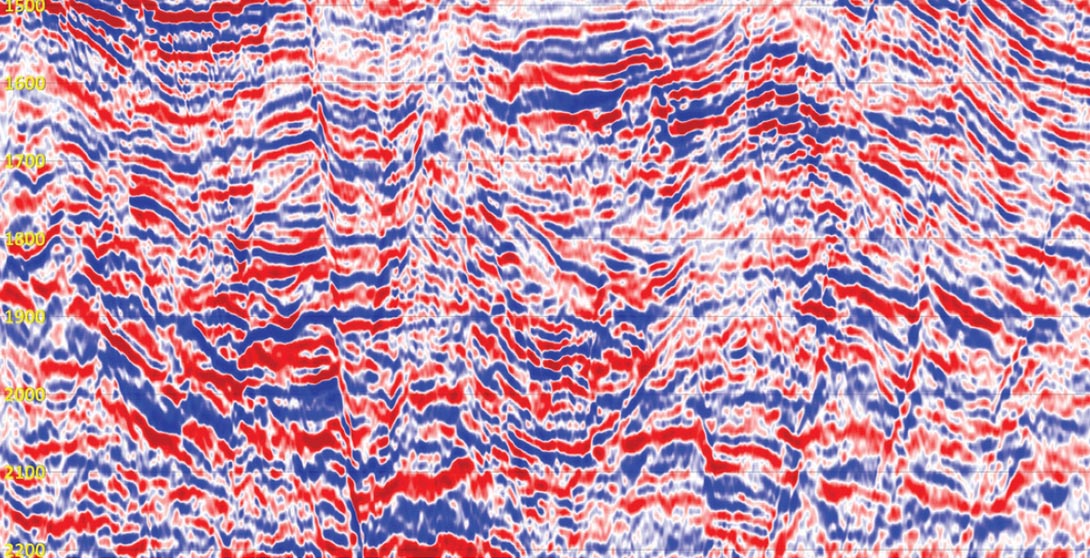
Consider Figure 2, a section of 2D data from offshore Peru (data courtesy PeruPetro). Although you are probably not familiar with the geological setting, the display itself is probably familiar to you. It is a variable density display and to produce it I have used the industry standard blue-white-red color palette. It is one of the three conventional seismic displays, the others being the wiggle trace display and the achromatic grey-scale display and like the other two, it is easily recognizable to any practicing geoscientist.
Take a very good look at it and then ask yourself: “Is this display theoretically correct?” Taking that one step further, what does the question even mean; we have never asked it before. We have gone about our business pushing the limits of both temporal and spatial resolution, evaluating the results of our efforts using displays such as this but we have never considered if this is the theoretically correct way of doing it.
And that is an important question because ultimately both seismic processing and interpretation are visual sciences. We know that we apply theoretically correct processes while preparing our data but our decisions are not based upon the data itself, they are based upon our perception of the data and perception is a visual science. Perception is defined as “the internal representation of the external world” (1). If this data is our external world, is our internal representation correct? Do we even know how to make it correct and what would it look like if it were?
Geologists and engineers need not listen. Everything we do is theoretically correct and everything that is theoretically correct, we do. Or so we think. Figure 3 is a chromatic reflectance display and using it, our perception of the underlying data is radically different. Look at it very carefully and compare it with the variable density display. I will argue that by itself, with no other supporting information, the difference between the two images is so significant that it proves the displays we have used our entire careers must be theoretically incorrect. I will argue, in this and subsequent papers, that they cannot be considered to be seismic displays at all.
There is something we have forgotten to do! There is a huge gaping hole in our theoretical treatment of our data. Figure 2 & Figure 3 are not just different displays; between the two lie entire sciences that we forgot to apply. To begin explaining what they are, what we forgot to do, I need to take you deep into the world of music appreciation.
You know music don’t you? It’s the other analog acoustic wavefield that we experience on a daily basis.
“It’s All Too Much”
If you are anything like me then you hate to have your time wasted. When I read a paper, I like the facts, clearly presented using the minimum of words. Get to the point and don’t waste my time getting there. With that in mind, I apologize because my point here is to do exactly the opposite. I plan to waste a few minutes of your time and I am in no hurry to do it. The point of this section is a long way off and the journey to it is, by design, somewhat convoluted. This is even stranger writing for me.
Here is a suggestion, actually a request. If you are in a hurry, put this aside until you have a few minutes to spare, a few minutes that you can devote entirely to yourself. Put the paper down, it won’t run off and then pick it back up when you have at least ten minutes of uninterrupted time. At the end of those ten minutes, there is a question and it is important but it won’t mean anything to you unless you take the full ten minutes.
What is it we forgot to do? I am going to begin by taking a closer look at music, the other analog acoustic wavefield that we experience every day. Don’t worry too much about where this section is going or about how it is written. There is a purpose behind both what I am writing and how I am writing it. For now, just sit back and relax. Nothing bad is going to happen in the next few minutes. I promise.
I have an exercise for you and it works better if you are relaxed so put your feet up on your desk if you want to. If you are more comfortable that way, go ahead and do it, no one will mind. But first, before you sit back, search out your favorite piece of music. That is very important! The point of the exercise is to simply listen to a piece of music, one that you know very well.
Before we go on, put on the best set of headphones or earbuds that you can find. You probably don’t want to use speakers but you can if they are better than your headphones. As long as you are relaxed; as long as you have a piece of music you love; as long as you use high fidelity acoustics, what I have in mind will work.
Please don’t use cheap speakers! That is important. I want you to hear the music as the composer/performer intended so if you have to go out and spend some money, go ahead, it will be worth it. I recommend my personal favorites, the Shure SE 215’s. I use them all the time. I used to listen to the ubiquitous white Apple earbuds but after using the 215’s, the Apple earbuds sound hollow and thin, like sound emanating from a tin can speaker. Trust me; you do not want that kind of sound quality here so if you need to buy new earbuds, do it. It will be worth it and the paper will be here when you get back.
You should also use your favorite piece of music, whatever it is. The genre doesn’t matter as long as you enjoy it. If you don’t have a favorite then you should listen to mine. In fact, this works best if you do listen to mine but I am not hung up on it. Listen to your own favorite if you want but if you want to do this right, listen to “It’s All Too Much” by the Beatles. Written by George Harrison, it is one of their lesser known works. You can download it from iTunes for $0.99. Don’t worry if you have never heard it before, it’s by the Beatles; you will enjoy it.
“It’s All Too Much”, most people, even die hard Beatles fans aren’t familiar with it. Strange then, that given all the wonderful music the Beatles produced that this one should be my favorite, that it should be so important to me. The reason goes back to the beginning of wavefield visualization, all the way back to December 1999. It was late in the day and I was trying and failing to produce my first wavefield display. Listening to music is something I rarely do while I am working but I was tired and frustrated so I started up my music player and put on my headphones. Finally, as I was about to give up for the day, I had a rare moment of insight. The display had lights and I hadn’t turned them on; d’oh - in hindsight a rather obvious oversight.
It only took me a few minutes to fix the problem and recompile. I reran the program and just by chance, the opening chords of “It’s All Too Much” came through my headphones at the same time as my first wavefield display emerged from the darkness. The music provided the auditory backdrop to what was a life altering visual experience. The two senses melded together, a perfect fit. Acoustic emotions and visual perceptions, completely in tune and in step with each other.
On second thought, don’t bother with your own favorite. If you have the “Yellow Submarine” album then you already have “It’s All Too Much”. Listen to it instead. It goes on for a while (six minutes) but you won’t mind. I’ll wait while you find it. Oh, one more thing. Don’t get hung up on the opening line. If you can’t make out the first few words, they are, “To your mother”, a strange sentiment from the Beatles. It’s not why this song is so important; it is just a nice way to begin.
Don’t click the play button yet, we’re not quite ready. There is one more thing you have to do!
You have to close your eyes. Admittedly, that will make clicking the play button a little difficult but I think you will manage. Closing your eyes is an essential part of the exercise and for good reason. Humans are Catarrhine Primates and as are all primates, we are visually obsessed creatures. All other mammals are dominated by their olfactory sense but we primates are so visual that if our eyes are open, all other senses take second place. To fully appreciate the music, you have to close your eyes; that is a fact; it goes back a very long way.
Tell your eyes to take a break. You don’t need them for the next few minutes and they will appreciate the time off. Take a few deep breaths and when you are relaxed and ready, close your eyes and hit the play button. Whatever song you choose, listen to it all. Don’t open your eyes until it ends; don’t read ahead; don’t think about where this is going; just sit back, relax and experience the music.
The questions will wait for you.
Cycles of Music
As I said, that was very strange writing for me and probably even stranger for a scientific journal. What I was trying to do was produce in you an intense sensory experience. You could casually listen to the same music while you work, without concentrating on it and with using cheap low-fidelity speakers. If you used your own music then you probably have. You may have done that dozens or even hundreds of times. You may have, as I have, listened to certain songs almost continually since you were a child. Even so, I’ll bet that if you followed along with me, if you used high-fidelity acoustics, if you were relaxed and focussed then you would have noticed subtleties in the music that you never knew were there.
I’ll bet that it was almost like listening to it for the first time, which is just one of the points I was getting to.
So, with all this time wasted, here is the question that is so critically important: “What did you just do?”
There are two possible answers.
Did you:
a. Listen to digital music.
Or did you:
b. Experience an analog acoustic wavefield.
The answer has more to do with seismic than you would first think because music and seismic data although at different ends of the acoustic frequency spectrum are conceptually the same.
- Music, like seismic, begins life as an analog acoustic wavefield.
- We then record it digitally or, as is the case with Its All Too Much, we make an analog recording and digitally remaster it.
- The digital music is then processed and remixed using algorithms very similar to our own.
- We then spare no expense to accurately reproduce the now processed analog wavefield using high-fidelity speakers.
- Which we then experience.
The answer to the question is that whereas we listened to digital music, we experienced an analog acoustic wavefield. Between the two is the subject of high-fidelity acoustics, which is itself a venerable old science. Research into how to accurately reproduce sound waves, how to make better speakers and headphones, has been ongoing since the 19th century and it is just as active today as it has ever been.
And if you are fortunate enough to have both the Shure Se215’s and Apple earbuds, then you will quickly see just how important that research is to our experience and perception of the underlying data.
Cycles of Seismic
With all this in mind, let us now repeat the same exercise but this time with seismic data. Figure 4 is a conventional grey-scale display of the same data shown in Figure 2. Again, sit back and relax and just look at this data until you feel you have taken enough out of it. Then, answer the question below. It should be familiar to you by now.
What did you just do? Again, there are two possible answers.
Did you:
a. Look at digital seismic data.
Or did you:
b. Experience an analog acoustic wavefield.
The question is the same but the answer is very different. Consider this:
- Seismic, like music, begins life as an analog acoustic wavefield.
- We then record it digitally or, as is the case with pre 70’s data, we make an analog recording and digitally transcribe it.
- The digital seismic is then processed and remixed (stacked).
- We then go to absolutely no expense to simply display the digital amplitudes using 70’s era low-fidelity technology.
- Which we then look at.
The answer in this case is that whereas with music we experience an analog acoustic wavefield, with seismic we only view the digital amplitudes. We never recreate the processed analog wavefield! That is what we forgot to do. We forgot that seismic data is not digital amplitudes, it is an analog wavefield and recreating it from its component amplitudes is far from the nontrivial exercise we have taken it to be.
High-fidelity auditory acoustics, high-fidelity visual acoustics, the sciences behind each are different but the objectives are the same. The objectives are to accurately reproduce an analog acoustic wavefield and whereas the first is a venerable old science, one that has been around for more than a century, the second is a new science, one that has only become possible with the emergence of graphic processing units over the past decade.
Conventional Seismic Displays
The display is to seismic what speakers are to music. It is the device that should visually recreate the acoustic wavefield and if seismic were invented today, it would. Seismic, of course, was not invented today; digital seismic came along in the late 60’s and early 70s’s at a time when we lacked today’s gpu technology. By necessity, we developed other means to view it so the question is; “If seismic were invented today, would we develop any of the conventional seismic displays that we have used all our careers?”
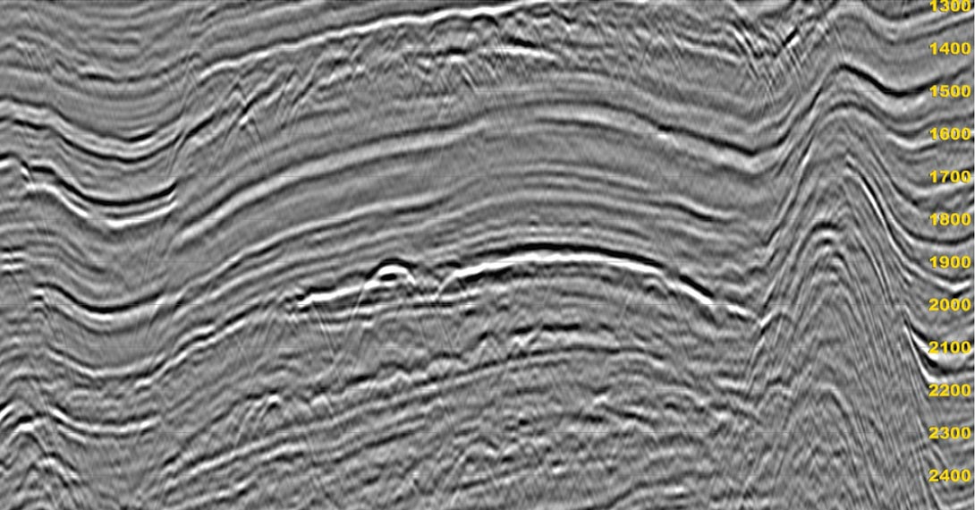
Wiggle Trace Displays(2)
Figure 8 is a typical wiggle trace display and it is probably the most instantly recognizable display to any practicing geoscientist. It is the display that many of us used exclusively during the early part of our careers but lately, it has fallen somewhat out of use. And that is a pity. Wiggle trace displays typically require a lot of screen real estate, which was originally an issue but is less so these days. Even so, the displays are discontinuous in spatial dimensions and so they are often deprecated in favor of the more visually continuous variable density and grey-scale displays.
As I said, that is a pity because their lack of spatial continuity is an advantage under certain circumstances. Let me rename them. Instead of using the visually descriptive term “Wiggle Trace Display” I will use the term “Waveform Display” instead because it is more descriptive of what they really are. This gives us an idea of why we might use them in the future.
This is one situation where a disadvantage under one circumstance is an advantage under another. Waveform displays lack spatial continuity which means we cannot use them to examine the wavefield itself. That said, sometimes, all we are interested in is reflector character and when we need to do that, spatial continuity is a disadvantage. If we need to examine waveforms, this is the perfect way to do it. I will leave the discussion of their psychophysical properties until another time and simply say that any time we need to examine reflector character this is the display we should use.
Surprisingly, given that waveform displays date back to the origin of the seismic method, if we invented seismic today, we would still need them. We would probably never use them as general purpose displays but we would need them anytime we were examining waveforms, which in Southern Alberta especially, we often do.
Chromatic Variable Density Display (3)
Figure 6 is the variable density equivalent of Figure 5 and once again, I have used the industry standard blue-white-red color palette. The question is whether or not we would invent this display today. To answer that, let me put the display itself into perspective.
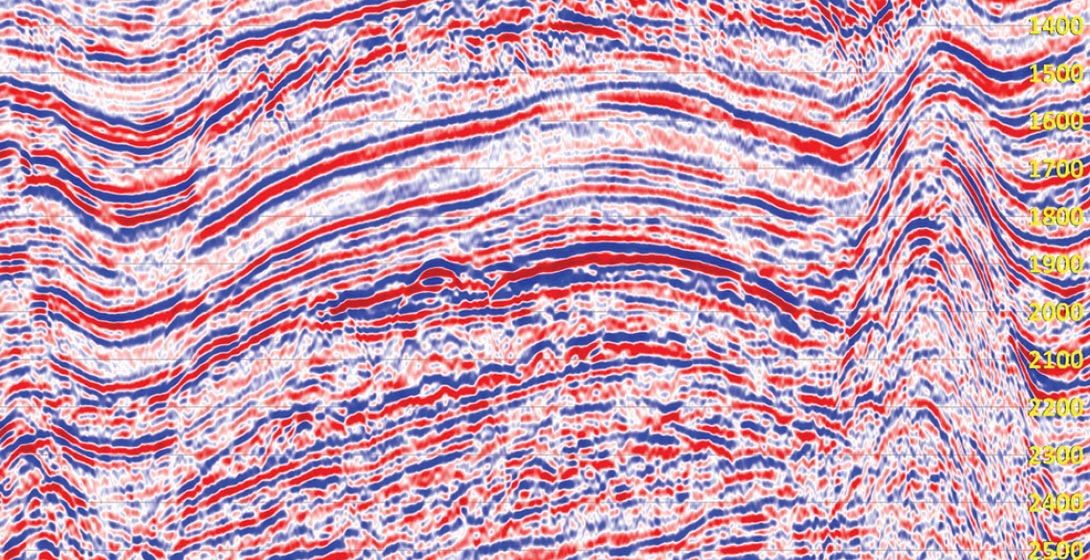
Consider that a typical modern 3D survey may cost well over 100 million dollars to shoot and well over 10 million dollars to process. Consider the billions of dollars and the thousands of work years of research that has gone into developing the acquisition, processing and interpretation systems that we use to come up with our final drilling locations.
Now consider that after we have spent all that money and time and effort, that we base our decisions of where to place our wells upon a display that is little more than a chromatic square wave. You can argue that this is a very limited color palette and you would be right, it is. Still, pick up any journal from the 70’s up to today and you will see it being used. You will see this image and others using more imaginative but equally as uncommunicative color palettes throughout(6).
Chromatic variable density displays are still one of the most heavily relied upon displays in the industry but continuing on with our music analogy, using them to display seismic data is the geophysical equivalent of listening to a recording of the London Symphony using a speaker made from a string and a tin can. It boggles the mind to think that if we invented seismic data today that we would ever see this presentation of it.
If my opinion on this is not clear enough let me be more explicit; unlike waveform displays, chromatic variable density displays have no redeeming features at all. They are an embarrassment and should, in my opinion, be immediately (but quietly) phased out of the industry.
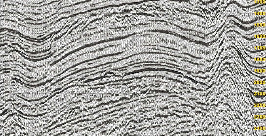
Achromatic Grey-Scale Displays (4)
Figure 7 is an achromatic grey-scale display of our example dataset and it is the third of the conventional seismic displays. Although they are produced in the same manner as chromatic variable density displays, from a psychophysical perspective, grey-scale displays are completely different. Visually, we process achromatic and chromatic information separately and for different purposes. The achromatic is processed first and from it we develop our primary sense of the form of an object. We then use chromatic information to subclassify the form and fill in details but we base our perception of the world around us mainly upon achromatic information.
That is why grey-scale displays appear to be almost three-dimensional whereas their chromatic cousins do not. An interesting aside but completely irrelevant because a grey-scale display, like a variable density display is not continuous in any dimension.
A wavefield is physically continuous in time and space. Waveform displays are useful because they are continuous in time but this display, although visually it appears to be continuous, is still just a picture of amplitudes. Each pixel in the image represents the value of a given trace and sample. It contains no information about how those samples connect to the surrounding ones, relying upon our visual system to infer the connections instead.
Grey-scale displays do not show us the true form of the wavefield and provide almost no amplitude information at all. Surely, if we were smart enough to invent seismic data today, we would be smart enough to come up with a better way of displaying it than this.
The Seismic Mindset
Mindset:
In decision theory and general systems theory, a mindset is a set of assumptions, methods or notations held by one or more people which is so established that it creates a powerful incentive within these people to continue to adopt or accept prior behaviors, choices, or tools.
Despite what you may think, nothing that I have said so far is in any way controversial. Everything is patently obvious but it only becomes obvious once you look beyond your current seismic mindset. Ask any practicing geoscientist what seismic data looks like and they will in all probability point to one of the conventional displays I have just discussed and say: “It looks like that.” If you asked me the same question before I began studying wavefield displays (and for a long time after) I would have given you the same answer.
From my own experience, seeing through that mindset was difficult and it took me a number of years before I even began to suspect that it was there. Despite their venerable familiarity, however, conventional seismic displays are just seismic amplitude displays; they are not seismic wavefield displays. Our collective mindset says that they are what seismic data looks like but seismic data is something else entirely and it contains far more information than we ever thought was possible.
You may disagree with this statement but none of the comments that I have made about conventional displays are, in my opinion, controversial. They are, however, by design, provocative. I intended them to sound the way they did because I wanted to get your attention. In my opinion, having worked with wavefield displays for over a decade, our acceptance of the visual status quo conventional displays provide is the most significant problem we face in the industry today. It is time we got over it; it is time we moved on from 60’s and 70’s era technology and started to fully experience our data.
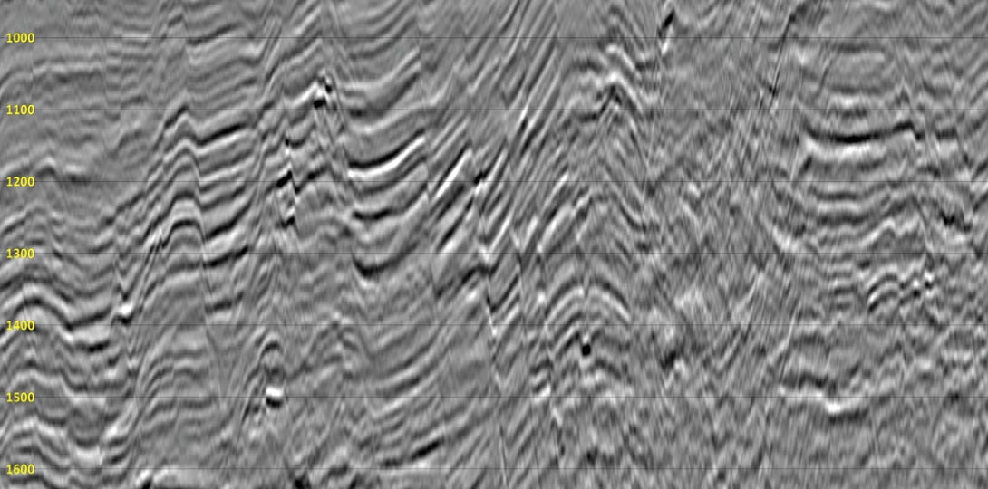
To reinforce the point, consider the next two images. Figure 8 is what 70’s era seismic amplitudes look like. We have used this type of display almost unchanged since then. Is there any other aspect of acquisition, processing or interpretation that has remained so unaffected by all of the technological revolutions that has occurred since then? I will argue that there is not and that every process applied to produce this data is different than it was forty years ago. Except, of course, for this simple archaic image.
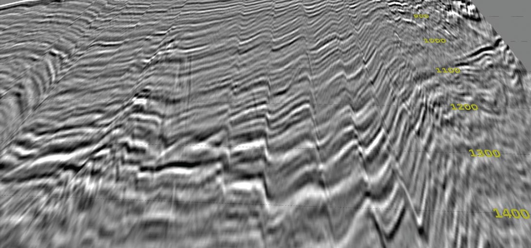
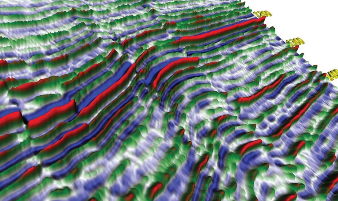
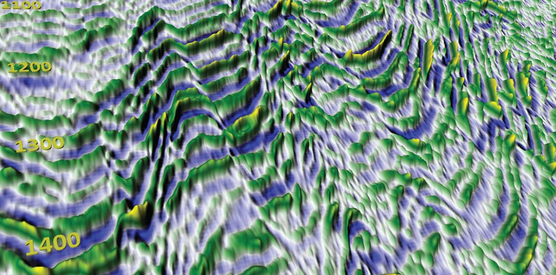
Now, contrast the grey-scale display with Figure 9, which is what a seismic wavefield looks like. Producing this display is non-trivial and it requires substantially more on-the-fly processing power than does producing a simple image. The display itself never physically exists, it is all assembled on the graphic card while rendering. The lighting, the tessellation, the coloring are all done in real time which, as you can imagine, was somewhat difficult to do in the 70’s.
I am not saying that we should have produced wavefield displays back in the 70’s. That was impossible given the technology of the day. What I am saying is that even though we could not produce them, we still needed them. We should have used wavefield displays all along but because we haven’t, because we were forced to accept very poor substitutes, our mindset still confuses and limits our perception of what seismic data really is.
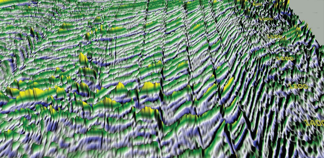
You may not agree with me at this point in time but take a close, comparative look at Figure 8 and Figure 9 and tell me that when I say seismic data has far more potential than we ever realised that I am wrong. One of my principal points is the idea that we have never fully appreciated the capabilities and potential of the seismic method. When I say this, it may sound like I am the bearer of bad news and that I am being unfairly critical of our past efforts but I am not. I do not care about the past; about what we might have been able to do if gpu technology had come along sooner. All I care about is the future and reaching the seismic methods ultimate potential. Take another close look at Figure 9 and tell me that we are not still a long way short of it.
High–Fidelity Visual Acoustics
Seismic data does not naturally form an image, colored or otherwise and the seismic wavefield does not naturally segregate into individual traces. Seismic data naturally forms a three-dimensional surface and if we invented it today, that is undoubtedly how we would view it.
High-fidelity visual acoustics is the science and technology of how we form that surface and initially, looking at images such as Figure 9, it might appear to be simple. Seismic data forms a regular mesh of samples, one, which ignoring the data itself, is trivial to tessellate(7). I certainly thought so at the beginning but I should have known better. As with all things seismic, if it looks simple, you are not looking closely enough. It may be trivial to tessellate a surface but seismic data, contrary to what I just said, does not form a surface. It forms multiple overlapping surfaces.
And this is where the fun begins.
In theory, a perfectly depth migrated section would form a single surface but in practice, whether we are looking at a shot record, an unmigrated section or even a reasonably well migrated section, each sample in the data contains energy from multiple sources. Each source whether it is a diffraction, an out of plane reflection, coherent noise, a multiple or a converted wave actually forms its own surface and what we call a record or a section is an amalgamation of them.
The three-dimensional surface that we form from our amplitudes is never unique and tessellation, which is the process of forming triangles from samples, can become an art form. It is an important art form because the primary difference between conventional displays and wavefield displays is that conventional displays visualize amplitudes whereas wavefield displays visualize the connections between the amplitudes. Depending upon how we connect them, the surface we form can take on different characteristics, emphasizing certain features and deemphasizing others.
A seismic section is always a complex mosaic of overlapping and often conflicting signals, some of which are geologically or seismically relevant and some of which are noise. To be theoretically correct, which if you remember is our goal, we have to perceive them all. It is not the job of the display to filter out data; that is the job of the processing. If there is a signal somewhere in the data then we need to see it. If it contributes to the amalgamated surface, then we need to know it is there.
The problem comes when the seismic signature of our target is not the dominant signal on the surface. Seismic events are manifested at all amplitude levels and there is no direct correlation between the strength of any given event and its importance to our interpretation. Sometimes we are looking for things that exist only on the edge of temporal and spatial resolution and tessellating the surface according to the needs of the dominant events may inadvertently smear out the events we are looking for.
There is much research that needs to be done on three primary fronts, each of which has its own form of wavefield display.
Achromatic Reflectance Display (5)
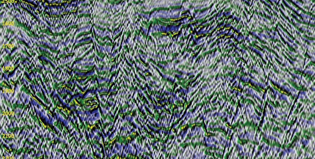
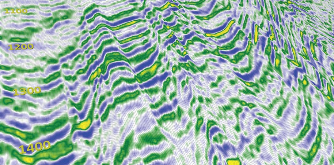
The simplest form of wavefield display is the achromatic reflectance display. Reflectance, also known as shaded relief (Batson, 1975), is a picture of how a surface reflects light of a given orientation. It is used extensively in other fields and we often use it ourselves when visualizing horizon surfaces for example. Surprisingly, however, despite its familiarity and beyond my own work and a short note by Barnes (2003), we have never used it when visualizing vertical seismic profiles such as Figure 10.
An achromatic reflectance display is the wavefield equivalent of the familiar grey-scale display with one significant difference. A grey-scale display converts amplitude to intensity whereas a reflectance display converts the first derivative of the surface to intensity. As such, it is a more natural presentation to us and our visual system is better able to interpret it. It is also not as sensitive to absolute amplitude and so we can follow low-amplitude events better.
Calculating reflectance requires knowledge of the surface normals which are dependent upon the tessellation schema used. Ignoring tessellation for the moment, there are other aspects of reflectance that need to be studied further. The displays I have shown so far use simple diffuse lighting and a single light source. Consequently, they only highlight specific dips, ones that are perpendicular to the direction of the light. Given the importance of achromatic information to our perception of form, this is a very simplistic treatment.
The light used in Figure 10 is directed from the upper left and so highlights events dipping from the upper right to lower left. This makes one arm of the diffractions visually more apparent which is not necessarily what we want. Under certain circumstances we may only want to see one arm but we may want to see both equally as well. This is just one simple example of why we need to pay more attention to lighting.
Here are just a few other areas that we need to consider and research in the future.
- How do we image all of the dips equally without confusing the display?
- Are there advantages to including specular highlights and shadows?
- Our monitors may be able to show 16 million colors but only 255 of them are shades of grey. Are there advantages to using displays capable of 11 bit rather than 8 bit intensities?
Chromatic Reflectance Display
The second form of wavefield display is the chromatic reflectance display. It uses a computer graphics technique called bump mapping (Blinn 1978), to combine a reflectance image with a chromatic variable density and despite being two–dimensional, the results, as shown in Figure 11, can be quite informative. The display uses color but hopefully not in the way we have used it in the past.
I am highly critical of our attempts at trying to represent the full spectrum of seismic information using color alone. As I said previously, for both psychophysical and practical reasons, these attempts will never work and we should abandon the efforts. That is not to say, however, that color is not important because it is vitally important.
It is a fact that we gain most of our perception of form from achromatic information but we use color to subclassify the form and fill in details. If you look at Figure 10, it is clear we need to do this. Figure 10 cries out for color. There is so much information in it but it all looks the same. We need color to allow us to focus on the relevant and ignore the irrelevant.
There are ways for us to do this because as primates, we use color to find food and there are specific colors that we are genetically attracted to. Figure 11, for example, uses a palette that has yellow (one of the colors we are attracted to) as a highlight color and green (a color we see very well but tend to ignore) and blue (a color we do not see very well at all) as base colors. It is visually “calmer” than conventional color palettes but it is also very simplistic.
In my view, going forward, how we apply color to the surface of the wavefield will be a major area of research. Now that we have rejected (?) the notion that we can use color by itself, we can use it for more appropriate purposes. But first we need to determine what role it should it serve. Being deuteranopic, I am open to suggestions.
Seismic Wavefield Display
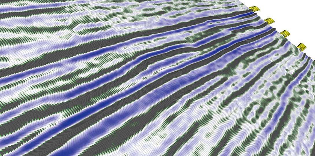
Achromatic and chromatic reflectance displays are, in a sense, theoretically correct because they show us the connections between the amplitudes. But they are limited for the opposite reason that conventional displays are limited. Conventional displays show us amplitudes but not the connections between them. Achromatic and chromatic reflectance shows us the connections but not the amplitudes they connect. A true waveform display must show us both and the only way to do that is to treat seismic data as being a three-dimensional surface and render it as such.
Figure 12 is a true wavefield display and if the seismic method were invented today, this is undoubtedly how we would experience it. That said, in a sense, it is analogous to 70’s era migrations. It is theoretically correct but only up to a point and here is where we get back to tessellation and the most appropriate field of study for any geophysicist; the pursuit of seismic resolution.
As geophysicists we live and breathe resolution and what we have is never quite enough. We are always looking for more and consequently research into both temporal and spatial resolution is active and ongoing. We are always looking for things that lie closer to the theoretical limits of both but have we run into an impasse?
One of my purposes in writing this paper was to make you question your concept of resolution. We think of it in theoretical terms, what I hope I have done in this paper is convince you to think of it in practical terms. And here is a practical question: “Have we pushed temporal and spatial resolution so far that we have outstripped our ability to detect the features our wavelets resolve?”
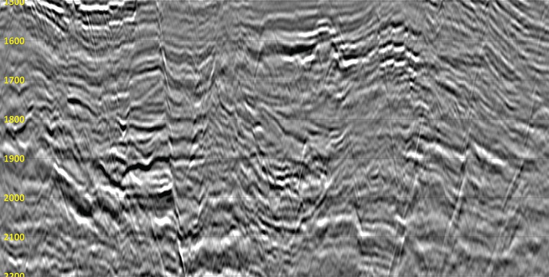
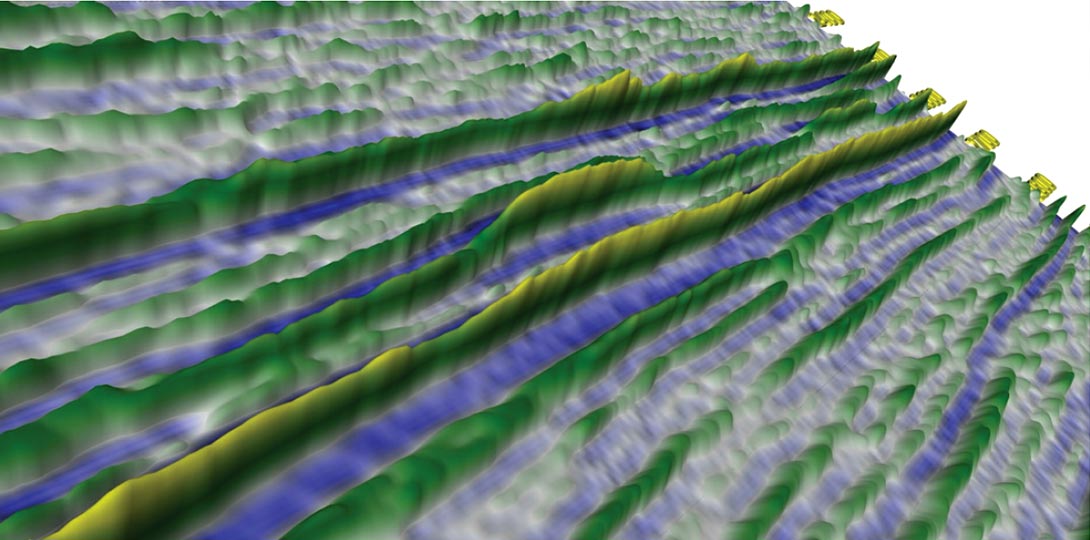
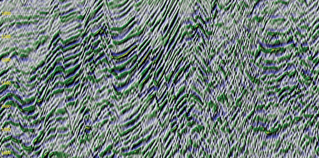
That is a very practical question. What features exist in our data that we are unable to visually detect in our displays? Although it is hard to quantify, in my estimation the visual resolution of Figure 12 is at least an order of magnitude higher than any of the conventional displays of the same data. I understand that it is unmigrated and that nobody would interpret it as it is. I chose it for that very reason. I needed an example where I knew that there were signals we should see but historically couldn’t. The diffractions fit perfectly. This section is visually dominated by diffraction patterns. They are everywhere you look and every sample in it contains energy from multiple diffractions. Yet, if you look back at the waveform display I showed in Figure 5, most of them are barely noticeable.
From an interpretation perspective you can argue that we do not need to see diffractions but the point is; can you argue we should not see things as visually dominant as diffractions. If you cannot see the diffractions on Figure 5, what can’t you see when the data is migrated?
To answer the practical question I asked earlier, in my opinion this example indicates that as soon as we switched to digital processing back in the early 70’s we outstripped our ability to evaluate the results. And all of the advances we have made in acquisition and processing since then have only made the situation worse.
There is a link between tessellation and resolution. The visual resolution of Figure 12 is higher than any of the conventional display but even so, the display is tessellated using a simplistic schema and cannot, therefore, correctly image all of the conflicting dipping events. It is better but it is a long way short of what we need.
Final Thoughts
Returning back now to my introduction, I understand that I have yet to prove any of the points I have discussed. This is just an introductory paper and my primary purpose in writing it was to make you think more critically about the data you process and interpret every day. I will in short order publish other more informative papers that will provide supporting evidence. Until then, I will close with these statements.
All I have shown so far is that by tessellating our data and forming a single surface from it we can perceive more of the resolution contained in the underlying data. But in a sense, Figure 12 has exactly the same problem as conventional displays. We can’t see what it doesn’t show. We rely on our displays to communicate to us; what they don’t communicate we don’t know is there. Figure 12 shows more than any of the conventional displays but I can’t tell you how much more resolution there is that it is not showing.
It is important to understand that we have not continued our use of conventional displays knowing how much information they were leaving behind. We did not know and consequently we lacked the motivation to actively pursue better displays. The wavefield displays I have shown here hopefully provide that motivation but, and this is a point that I need to stress; they are only the starting point.
Our goal is to push seismic to its theoretical and physical limits. If we adopt wavefield displays we can make a quantum leap towards that goal. How many leaps are there left? If you love seismic as much as I do, then you too will want to find out.
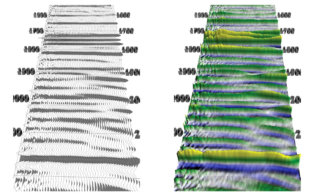
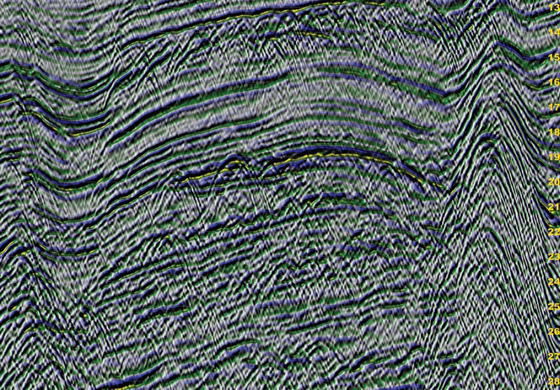
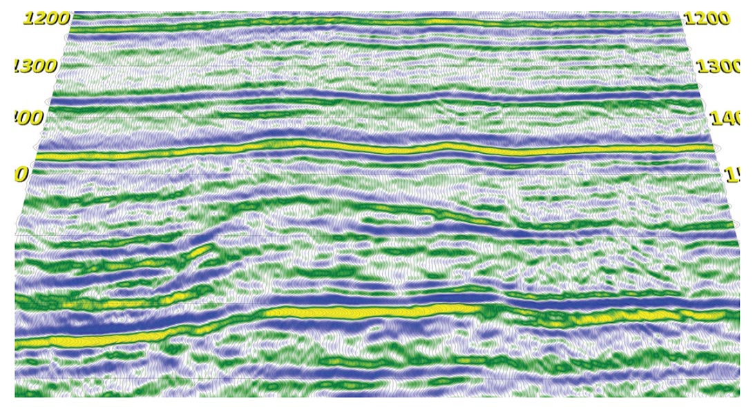
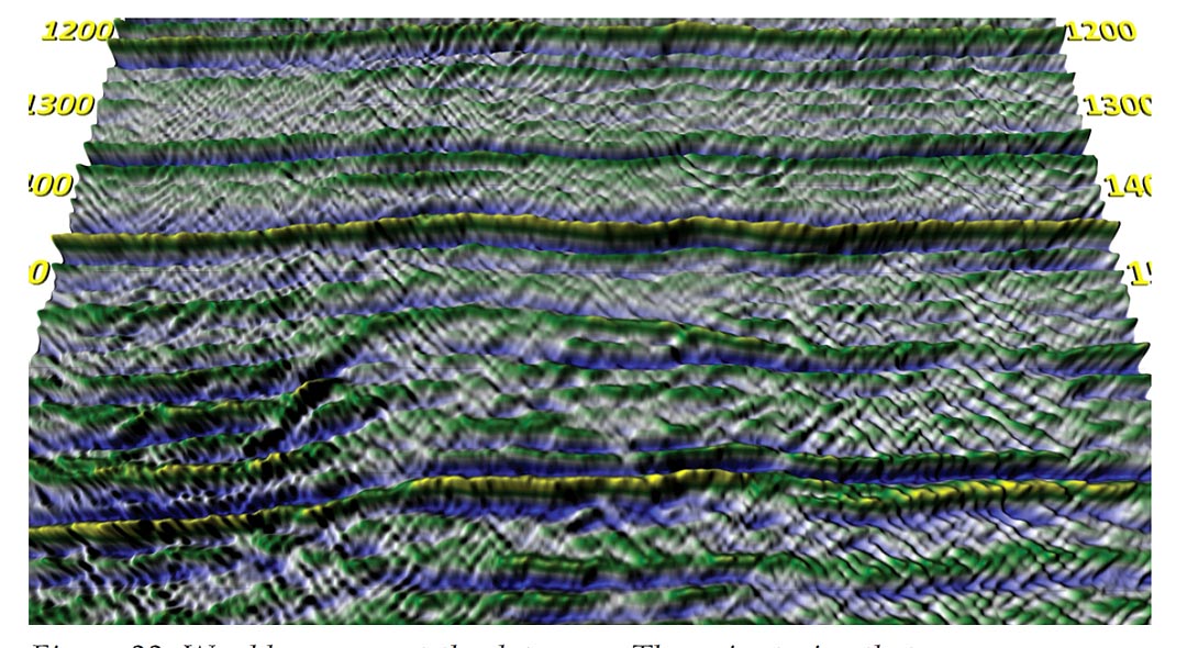
Figure 14. (right) A wavefield display of the same data shown on the right. Note the better presentation of amplitudes along the reflectors, especially in the 1700 – 1800 ms. region.
Example Wavefield Displays
The series of examples shown in Figures 13-22 illustrate some comparisons between wavefield displays and the displays that would typically be used to view them in an everyday situation. All of the displays shown here and previously were initially published in my PhD. Thesis.
Acknowledgments
This paper, the first I have ever submitted, caps what is turning out to be one world class comeback, one I have been working towards for over twenty years. The list of people I have to thank for it goes on forever. It includes but is not limited to, one world class surgeon, three psychiatrists, numerous “smart” doctors, one ten week wonder, three hours trapped in the middle of Lanezi Lake, several hundred junior soccer players and four nameless but fortunately well-mannered grizzly bears. Thanks everybody, the grizzlies especially.
Beyond that there are three people/groups that deserve special mention. The first is my long-time friend Dr. Larry Lines who convinced me in 2002 that beginning my PhD at the age of 50 was a good idea. Thanks Larry, perhaps sometime in the future I can return the favor.
The second is PeruPetro who released the Trujillo data set for research early in my PhD. When I began my research, I had yet to convince myself that wavefield displays were anything more than engaging curiosities. It was the Trujillo dataset that finally made their significance clear. If not for Trujillo and the other data sets that PeruPetro provided, I might well have abandoned the displays and gone onto something more profitable.
The third and for reasons more than just maintaining my unblemished record of spousal perfection is my wife Jan. It has been my experience that women, by marrying us, always believe they are saving us. Saving us from what is never made clear and they tend to resent our suggestions. In our case we both know that it was life, for me, as a crazy old man living somewhere behind a dumpster.
I have finally decided to talk about it but not on any web site. I am, as both Jan and the professionals say I must, writing the book about what happened. It will be called “The Race among the Ruins.” It starts badly and goes downhill for a very long time but it ends very well. It is that ending that I am driven to talk about. It ends better than anyone could hope for and I need to write the book to explain why.
Both Jan and I understand the significance to me of this first paper. I have always believed that I have a contribution to make and a responsibility to make it. Nothing that has happened has freed me from that obligation but for so many years, it looked beyond me. This paper is not an end it just marks the point in time when I finally begin making my contribution.
The other day, as we were going over the final edits to it, I asked her why she stayed with me when everyone else had left, when everyone else was telling her to leave. She told me that she always knew that someday I would get it right.
You will have to ask her yourself if I finally have; I can’t get a straight answer out of her.

Related Reading


Join the Conversation
Interested in starting, or contributing to a conversation about an article or issue of the RECORDER? Join our CSEG LinkedIn Group.
Share This Article