
Matteo Niccoli graduated from the University of Rome, Italy, with an honors degree in geology, and holds an MSc in geophysics from the University of Calgary, Alberta. He worked for Canadian Natural Resources in Calgary, for DONG Energy in Stavanger, Norway, and is now with the Geophysical Services group at ConocoPhillips in Calgary. In his free time he does research and occasional consulting in geoscience visualization with his company MyCarta. On his blog he writes about exploration data enhancement and visualization, as well as image processing and its applications in geoscience, medical imaging, and forensics. He is a member of APEGA, CSEG and SEG, and recently joined the Recorder committee as technical editor. For visualization related questions he can be contacted at matteo@mycarta.ca and is @My_Carta on Twitter.
Seismic interpreters use colourmaps to display, among other things, time structure maps and amplitude maps. In both cases the distance between data points is constant, so faithful representation of the data requires colourmaps with constant perceptual distance between points on the scale. However, with the exception of greyscale, the majority of colourmaps are not perceptual in this sense. Typically they are simple linear interpolations between pure hue colours in red-green-blue (RGB) or hue-saturation-lightness (HSL) space, like the red-white-blue often used for seismic amplitude, and the spectrum for structure. Welland et al. (2006) showed that what is linear in HSL space is not linear in psychological space and that remapping the red-white-blue colourmap to psychological space allows the discrimination of more subtle variation in the data. Their paper does not say what psychological colour space is but I suspect it is CIE L*a*b*. In this essay, I analyse the spectrum colourmap by graphing the lightness L* (the quantitative axis of L*a*b* space) associated with each colour.
In this essay x is the sample number and y is lightness. In the graph the value of L* varies with the colour of each sample in the spectrum, and the line is coloured accordingly. This plot highlights the many issues with the spectrum colourmap. Firstly, the change in lightness is not monotonic. For example it increases from black (L*= 0) to magenta M then drops from magenta to blue B, then increases again, and so on. This is troublesome if the spectrum is used to map elevation because it will interfere with the correct perception of relief, especially if shading is added. The second problem is that the curve gradient changes many times, indicating a non-uniform perceptual distance between samples. There are also plateaus of nearly flat L*, creating bands of constant tone, for example between cyan C and green G.
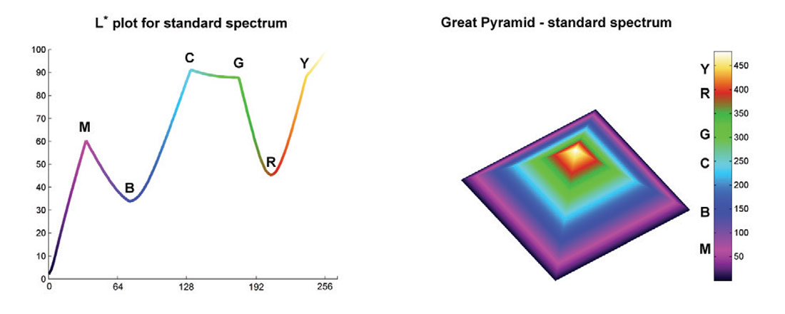
Let’s use a spectrum to display the Great Pyramid of Giza as a test surface (the scale is in feet). Because pyramids have almost monotonically increasing elevation there should be no substantial discontinuities in the surface if the colourmap is perceptual. My expectation was that instead, the spectrum would introduce artificial discontinuities, and this exercise proved that it does.
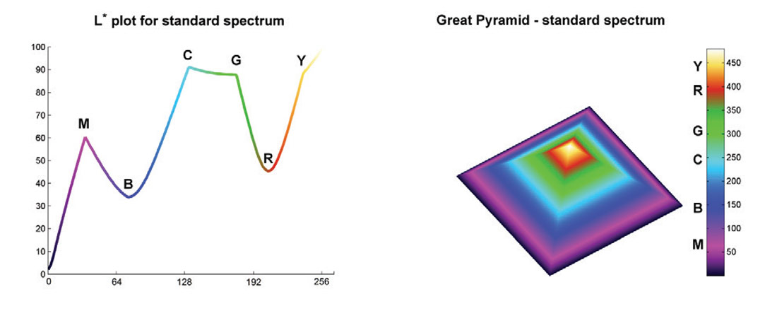
In an effort to provide an alternative I created a number of colourmaps that are more perceptually balanced. I will post all the research details and make the colourmaps available at ageo.co/1A4Kyai. The one used below was generated starting with RGB triplets for magenta, blue, cyan, green, and yellow (no red), which were converted to L*a*b*. I replaced L* with an approximately cube law L* function, shown in the bottom left figure – this is consistent with Stevens’ power law of perception (Stevens 1957). I then adjusted a* and b* values, picking from L*a*b* charts, and reconverted to RGB. The results are very good: using this colourmap, the pyramid surface is smoothly coloured, without any perceptual artifact.
Q&A:
Matteo, tell us how you perceive the application of RGB and HLS color schemes to seismic data. Which color scheme should be used for what kind of data and why?
I’ll start with color schemes for sequential data, which include elevation, in time or depth domain, and could include some attributes like acoustic impedance. For these kinds of data it is good in principle to use a scheme with a rainbow-like progression of colors, as color is very useful to highlight semantic regions in the data and make comparisons (Rogowitz, 2009). However, there is a requirement for the lightness progression in the colors (or alternatively the intensity) to be monotonically increasing (strictly increasing), as shown for example by Rogowitz and Kalvin (2001) and Rogowitz et al. (2009), so that equal increments in the magnitude of the data are represented by equal perceptual distance between points in the color scale, and lightness can convey the elevation information without introducing bias or artifacts.
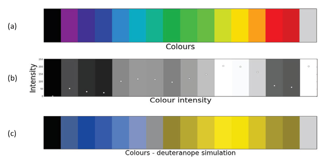
The problem with the majority of RGB and HSL default schemes is that the lightness associated with the color progression is not ordered in that perceptually monotonic fashion just described. I illustrate this in Figure 1, which is part of an example from a tutorial published on The Leading Edge (Niccoli, 2014).
Suppose our data is the simple 1D series of integers from 1 to 16. We could represent this series with the 16-hue spectral color map shown in Figure 1a, which at first sight may seem like a pleasant and ordered sequence of hues. However, to ensure the sequence is also perceptually ordered we need to look at how these hues encode the magnitude in the data, and in this example it is done by converting the hues to intensity. The numerical series is plotted again in Figure 1b, this time colored by intensity. I think it is easy to see that the intensity varies erratically, but I’ve also superimposed an overlay plot of the actual intensity values (on a scale 0-255) to reinforce the notion.
So if we use the 16-hue spectral color map to represent the numerical data series we superimpose on the data structure another structure that is completely artificial. In the case of 2D data, in addition to the artifacts, a non-perceptual color map also obfuscates low-contrast features because of bands of nearly constant hue. There’s a good example of this at the end of the TLE tutorial (Niccoli, 2014).
I’ve often heard the argument that with consistent use, our brain accommodates for these non-perceptual artifacts, and this may be true, particularly when using a single dataset. But at some point I think the argument breaks down as the complexity of our projects increases and interpreters are more often than not combining multiple attributes in one display, perhaps rendering the blended result with a 2D or 3D color map.
And it certainly breaks down for people with color vision deficiency (improperly called color blindness). Figure 1c shows the color map from Figure 1a as it would be seen by a person with deuteranopia, the most common form of color vision deficiency. If this person were to look at it for the first time they would most likely conclude that there’s a structural high at the yellow, and then on either side a low (the dark gold colors) which would be incorrect. By using this color map, we’d confuse 8 percent of our audience (assuming the distribution of people with color vision deficiency in geoscience is the same as in the general population). There’s a good real data example of this effect on my blog post A rainbow for everyone; Steve Lynch and I presented another one at the Geoconvention in 2012.
Using a perceptually ordered rainbow-like color map would not result in any of the issues so far described. A good example is shown in the TLE tutorial (Niccoli, 2014).
Based on the same principles of perception, for periodic attributes such as phase and azimuth, I recommend using palettes that cycle around the hue wheel but keep the lightness constant. I will show one way to generate such an iso-luminant periodic color map in my next tutorial on The Leading Edge (Niccoli, 2015, manuscript in preparation).
Finally, for divergent data like amplitude, I am definitely not a supporter of the default red-white-blue divergent scheme. I’ve often noticed when switching between grayscale and red-white-blue (or red-white-black) that with the latter the white in the middle obfuscates subtle stratigraphic features in map view, and dramatically hinders the perception of faults in both section and map view.
Welland et al. (2006) have shown an example in which the remapping of the red-white-blue scheme to a psychological color space (e.g. perceptually monotonic lightness) allowed subtle variations in the data to be more easily discernible. Moreland (2009) argues that the white in this color scheme is a Mach band.
Mach bands, discovered by the physicist Ernst Mach, are optical illusions where the contrast at the edges between adjoined areas of different lightness appears enhanced by a natural edge detection system in the human vision. There are several ways in which Mach bands arise as shown by Pessoa (1996). In the red-white-blue colormap the Mach band is present because a region of high lightness is surrounded on either side by a ramp of decreasing lightness.
Moreland’s solution to eliminate the Mach band effect is to interpolate between red and blue using Msh, a newly defined, polar coordinate form of CIELab color space. His resulting color map seems promising, and is available on his website (see reference list). For my part, I’m working on an interpolation between yellow and blue in HSV color space that goes through achromatic gray, and I’m planning to compare it to Moreland’s using seismic data.
For amplitude interpretation work I’ve been using mostly grayscale. If the position of the zero amplitude is not critical this scheme is a good alternative to a divergent one, especially if the perceptual middle gray has been shifted to the middle of the color map, as in Froner al. (2013). Python code to replicate their adjusted grayscale will be included in my upcoming TLE tutorial (Niccoli, 2015, manuscript in preparation).
The importance of visualization of seismic attributes cannot be underestimated. But you often see interpreters displaying seismic attributes in strange color maps that do not optimally bring out all the data variation one is looking for. What is your take on this and what would you recommend?
I do agree that you do sometimes see really weird color maps. Perhaps they are relics of a pre-8-bit era where RGB values had been chosen to maximize the number of distinct contiguous colors, which somehow had made their way into the software defaults. However, many modern 8-bit or 16-bit default color maps are also not optimal, as argued in my previous answer. It is possible that many interpreters resort to them because they are the default.
In Evan Bianco’s post on defaults (The dangers of default disdain) Kevin Kelly comments: “...defaults are ‘sticky’. Many psychological studies have shown that the tiny bit of extra effort needed to alter a default is enough to dissuade most people from bothering, so they stick to the default…” This fits with the finding by Borland and Taylor (2007) that more practitioners in the field of medical imaging and analysis reject the default rainbow (many use grayscale): their statistics for the IEEE Visualization Conference proceedings from 2001 to 2005 show that over the five years, 51 percent of papers including medical images used rainbow, but the percentage increased to 61 percent without the papers including the medical images, with a peak difference in 2003 of 52 percent and 71 percent, respectively. I think these practitioners have more motivation to look beyond and make that extra effort, as shown for example by Borkin et al. (2011), who argue that using rainbow in artery visualization has a negative impact on task performance, and may cause more heart disease misdiagnoses.
My recommendation is to always choose carefully the color maps, based on task (Rheingans, 1999) or on perceptual rules (Bergman et al., 1995). A good list of available color tools can be found in Subtleties of Color Part 5: Tools & Techniques, by Robert Simmon.
In the next TLE tutorial (Niccoli, 2015, manuscript in preparation) I will show how to generate several task-based color maps programmatically (in Python), and will share with a Notebook both the code and the final color maps in ASCII format. Here’s an example of how to do this: first define the task, say interpret faults in section view; next, investigate which key property will maximize perceptual contrast for that task, in this example lightness with variable gradient – but still monotonically increasing – with higher contrast at low-to-intermediate amplitudes (Brown, 2012); finally, define a function to model the property and the appropriate color space, in this example a logistic sigmoid lightness curve in HLS color space.
Talking of visualization, there was a time some years ago when visionariums became popular and all big oil companies had them installed in their offices. It was opined at the time that they are very useful for seismic interpretation? Now we don’t seem to hear about them? What do you think happened?
Not really having had any experience about the immersive type of visualization rooms (and in fact very little experience with any 3D seismic data until a decade ago), I will keep my answer to this question short.
There’s a 2006 First Break paper by Maes and Hunter titled VR and immersive environments for oil and gas exploration. One of the arguments the authors make in favor of these immersive visualization rooms are operational integration. Having had experience in real time operational projects in both Calgary and Stavanger, Norway, I’ve seen good integration within geoscience teams and with the other disciplines (drilling, reservoir engineering), and no task that could not be accomplished using a collaboration room with a good projector and a blade workstation. My impression is that whenever there were some obstacles with operational integration it was because there were some disconnects or philosophical differences between disciplines, or because of software limitations (some are more conducive than others) in the case of issues with data integration.
The other argument made in the paper is that of the return of investment, with a “…reasonable expectation that a large-scale visualization capability reduces project costs and field errors by 5-10 percent...” and that “…return on investment is typically agreed to be less than one year”. Unfortunately there are no numbers or references in the paper to back up these assertions, whereas on the other hand the extremely high price tag that came with building these rooms is a fact.
Among the fellow geophysicists I talked to about this subject, Matt Hall took it upon himself to write a blog post on it (Why don’t people use viz rooms?), so I defer to him for a more in-depth discussion, and to those that wrote their perspective in the comments section of the post.
Besides the one-dimensional color maps that have been used over a period of time, more recently, 2D and 3D color maps have also been used for composite displays of seismic attributes. How much more information do the latter bring out as compared with traditional 1D color maps?
This is a great question. Our nervous system is not equipped to visualize images in more than three dimensions. Mathematicians train themselves to imagine in four dimensions (and more), and some claim that with a moderate effort everybody would be able to do that (for example the authors of the video lecture series Dimensions – A walk through mathematics to take you gradually up to the fourth dimension). However, when it comes to visualizing multiple 3D datasets at once, the best we can do is find smart ways to combine them into a single 3D dataset.
A classic example is that of spectral decomposition results, where you have output in x, y, time, and frequency, organized in multiple 3D volumes of constant frequency. One approach to reduce the dimensionality of spectral decomposition data is to select a time value of interest and hold it constant, for example at your reservoir level or cap rock level, and scan through the frequency volumes to find three frequencies of interest, then use those as color channels in an RGB blended volume. For cap rock studies I’d add coherence and use it as the forth channel in a CMYK blended volume. An alternative way to reduce the dimensionality of spectral decomposition data could be to use highlight volumes as in Blumentritt (2008).
For combining attributes, 2D and 3D color maps are a great tool. My favorite examples of attributes that can be combined with a 2D color map are coherence and amplitude, where coherence is mapped to lightness and amplitude to a divergent color scheme. As for 3D color maps, a fantastic example is Figure 20 in Chopra and Marfurt (2007) where hue is used to modulate dip azimuth, saturation to modulate dip magnitude, and lightness to modulate coherence. In this way our visual system is used to its fullest potential and the emphasis of structural elements maximized. For example, since “…dip azimuth has little meaning when the dip magnitude is close to zero and contaminated by noise…”, low saturation is used to mute those meaningless azimuths so that hue will highlight areas of high uniform dip (the semantic regions of Rogowitz, 2009), and the juxtaposition of areas of opposite dip will indicate anticlines and synclines. At the same time major faults are immediately evident as black features of low lightness, but they can still easily be tracked if they evolve laterally into flexural features, because the lightness increases and the dips are brought out with hue.
There’s also Matt Hall’s example on the blog post Colouring maps, where coherence is mapped to lightness, elevation and high amplitude anomalies are combined in a composite using hue, and alpha (transparency) is used instead of saturation to mute areas of low fold.
Some of the prominent applications of digital image processing are in 3D seismic processing and interpretation. What is your take on that?
There are many similarities between the fields of image processing and analysis, and seismic processing and interpretation. As you say many seismic applications are based on image processing technology, but it is not a one-way exchange, as demonstrated by Gerhard Pratt’s work (for example Pratt et al., 2007) on applying geophysical tomography to medical images; one of the topics he discussed at the CSEG 2008 Distinguished Lecture tour.
On the interpretation side, perhaps the best examples of application of image processing in seismic come from David Hale’s incredible work with semi-automatic interpretation of faults (2014 SEG/AAPG Distinguished Lecture tour), and with creation of geologic meshes from seismic images.
On the processing side I have a couple of examples from my personal experience. The first one has to do with developing an algorithm for automatic or semi-automatic separation of primaries and multiples that overlap in tau-p space. This idea resulted from a discussion with Oliver Kuhn around 2009 (at the time he was at Divestco). My solution involved a combination of Otsu image segmentation and image feature measurements to separate overlapping primaries and multiples, and a modified fast marching technique (the same used for robot navigation, for example) to separate primaries and multiples that did not overlap. At the time I got a ~70 percent solution sketched on a few pieces of paper and a bunch of Matlab code snippets, but it would be nice to go back and write a fully working prototype, for example in Python. If anybody is interested in a research collaboration, just fire me off an email.
The second example is Karhunen-Loeve decomposition, which in image processing is used to reconstruct multichannel remote-sensing images and to increase the color contrast in RGB images. In seismic processing it was popular for a while for noise attenuation and multiple removal (e.g. Yilmaz, 2001), but fell out of favor. However, a creative application of KL filtering worked extremely well for me last year in removing a top-of-chalk water-bottom multiple from a North Sea 3D (thanks to Jim Laing at Apoterra for the idea, and for making it work).
As a seismic interpreter, tell us about some of the tricks up your sleeve, which other interpreters can benefit from?
One of my favorite interpretation stories is about developing a depth conversion uncertainty workflow for a North Sea project. While working in Stavanger I was moved into a new team as they’d just announced excellent results from a delineation well. The target for this well had been selected by the team after the preliminary interpretation of a recently acquired 3D survey, and a single-scenario depth conversion of the time-domain horizons and faults.
Following this success the team was asked to deliver a reviewed reservoir simulation in 3 months’ time and present it at a peer review, which would also serve as a decision gate for our management to sanction the feasibility (or not) of reservoir development. This meant 6 weeks for the geomodeler to hand to the reservoir engineer an updated static model and full scale uncertainty analysis, and in turn, about 4 weeks for me to give (among other things) an estimate of the possible depth range for the top of the reservoir to be used for volumetric range estimates.
It was clear from the start that there would not be enough time for me to run multiple scenarios of velocity analysis of the new 3D so we used the results from a regional velocity study, which was based on a larger but older 3D (a merge, in fact). The author of that study had generated six different versions for the velocity of the overburden layer, four different versions for the Chalk velocity layer, and one version each for the other two layers, resulting (with some constraints) into sixteen alternative velocity models.
Using these models I generated sixteen reservoir top surfaces, which were in depth but unadjusted to the reservoir top depth encountered in the four reservoir wells. I then calculated a bulk volume between each of the reservoir top surfaces and the oil-water-contact and used the result to eliminate two extreme surfaces, one on the high side (highest volume) and one on the low side (lowest volume).
The next step was to flex the remaining fourteen surfaces to fit the reservoir top depth in the four wells, and from these flexed surfaces, many of which intersected one another in various locations, I generate two envelope surfaces: a ‘lowest surface’ at every location and a ‘highest surface’ at every location, which were used by the geomodeler as input for volumetric estimate and uncertainty simulation.
In terms of attributes, again during my time in Stavanger, I started using AVO maps to look for fluid effects. One way to generate these maps is to extract the maximum amplitude at the top of the reservoir on both a near (or near-mid) volume and a far (or mid-far) volume and then calculate and display the difference. In most of my projects the gas-oil contact stood out very clearly in these maps, in some cases even in moderately noisy areas.
I also like the examples in Chapter 10 of Chopra and Marfurt (2007) of coherence slices extracted on offset limited volumes, one of which in particular with a clearly visible gas-oil contact on the far offset slice. However, this method did not give satisfactory results in my case. It’d be interesting to find a project where both methods work well and compare the outcome.
If you look back at the developments that have taken place in seismic geophysics, some people say that there are bursts of brilliance interspersed with somewhat silent periods. Would you agree?
Yes, you do get that sense, that there had been some landmark events, like the introduction of digital recording in the 60s and the use of 3D seismic in the 90s, with these long, relatively uneventful periods in between. But are they really uneventful? I’d like to use a biological evolution as an analogy. When it comes to the evolution of species in the fossil record, there’s the theory of philatelic gradualism, and then there’s the theory of punctuated equilibria by Eldredge and Gould (1972). In the latter, we have periods of stasis and then short periods of rapid evolution. But does the stasis mean that nothing happens?
Perhaps there is a middle ground. I remember my paleontology professor explaining this using the evolution of some species of fossil bivalves as an example. It is possible that during these periods of stasis a large number of mutations occur in the soft tissues of the bivalves that are not registered in the fossil record, then suddenly we see speciation: this may have happened because morphological changes in the shell were necessary to accommodate for the accumulated changes in the soft tissues. But all along these organisms have been evolving. Similarly in seismic geophysics those quiet periods could be periods in which small changes accumulate, until a critical mass is reached.
I wonder if we are approaching one of those times of rapid change. Some people are talking about possible new revolutions, for example wireless recording and acquisition for wavefield reconstruction, and I also think of Steve Lynch’s work on Wavefield Visualization (for example Lynch, 2012).
Sometimes, coming up with genuine and bright ideas is difficult as they go against some of the existing facts or principles that have been followed for too long. That hinders innovation. Perhaps something like this might have prompted Voltaire, a famous French historian and philosopher to say, ‘It is dangerous to be right in matters on which established authorities are wrong. What would you say to that?
I could not agree more, and the best example of this is what happened to Galileo Galilei. After already having abandoned the Aristotelian models about the motion and falling of objects, which cost him his tenure at the University of Pisa, the Italian mathematician and astronomer developed his own version of telescope in 1609 and later discovered that Jupiter had moons that rotated around it, and not around Earth. His support of Copernican heliocentrism, which became known after a letter written to one of his students in 1613 was sent to the Inquisition, led to the charges of heresy on Copernican theory, and then to an intimation to Galileo himself to not support it or teach it. This held Galileo back (in small part perhaps for convenience, because of his financial difficulties, but mostly because he was a devoted catholic), although only for a few years. He came again into the favors of the Church thanks to his friendship with Cardinal Maffeo Barberini, who had been elected pope in 1623, but after his publication of the Dialogue Concerning the Two Chief World Systems he was charged with heresy and spent the rest of his life under house arrest. He was forbidden from publishing his work outside of Italy but ignored the injunction, and some of his works were translated and printed in the Netherlands prior to his death in 1642. For a perspective of the kind of opposition he was up against, notice that it has taken the Catholic Church until well into the 19th century to abandon its opposition to heliocentrism and more than 3 centuries, until 1992 with John Paul II, to issue a heartfelt apology for the wrongdoings during Galileo’s trial.
On the lighter side, Matteo, it is generally said that women have a stronger sixth-sense than men. Would you agree? Please elaborate.
This question reminded me of an experiment from a few years ago (Hall et al., 2010) in which researchers tracked the eye movements of both male and female observing facial expressions and found female spent more time on the eyes (same number of passes but more time per pass) and were more successful than men at recognizing expression and from those inferring non-verbal emotions. This happens subconsciously which is probably why we consider it sixth sense.
To go back to color visualization, have you heard of tetrachromat vision? Most people with normal vision are trichromats, which means that they have three types of cone receptors (this is very simplified). If each receptor type allows discrimination of approximately 100 shades of color, a normal person can discriminate (in the best illumination conditions) about 1 million colors. There is some evidence (see the BBC story The women with superhuman vision) that there are people with four types of receptors (hence the term tetrachromats), allowing discrimination of up to 100 million colors, and that they are all women!
References
Bergman, L. D. et al. (1995). A rule-based tool for assisting colormap selection. IEEE Proceedings, Visualization 1995.
Blumentritt, C. H. (2008). Highlight volumes: Reducing the burden in interpreting spectral decomposition data. The Leading Edge 27, no. 3, 330-333.
doi: 10.1190/1.2896623
Borkin, M. et al. (2011). Evaluation of artery visualizations for heart disease diagnosis. IEEE Transactions on Visualization and Computer Graphics 17, no. 12, 2479–2488, //dx.doi.org/10.1109/TVCG.2011.192.
Borland, D., and M.R. Taylor II (2007). Rainbow color map (still) considered harmful: IEEE Computer Graphics and Applications, 27, no. 2, 14–17.
Brown, A. (2012). Interpretation of Three-Dimensional Seismic Data. SEG Investigations in Geophysics, no. 9, 7th edition.
Chopra, S. and K. Marfurt (2007). Seismic Attributes for Prospect Identification and Reservoir Characterization. SEG/EAGE Geophysical Developments Series no. 11.
Corbett, P. (2009). Petroleum Geoengineering: Integration of Static and Dynamic Models. SEG/EAGE Distinguished Instructor Series, no. 12.
Eldredge, N. and S.J. Gould (1972). Punctuated equilibria: an alternative to phyletic gradualism. In T.J.M. Schopf, ed., Models in Paleobiology. San Francisco: Freeman Cooper, 82-115. Reprinted in N. Eldredge Time frames. Princeton: Princeton Univ. Press, 1985, 193-223.
Froner, B et al. (2013). Perception of visual information: the role of color in seismic interpretation. First Break 31 no. 4, 29–34.
Hale, D. (2012). Fault surfaces and fault throws from 3D seismic images. SEG Expanded Abstract, 82nd Annual International Meeting.
Hale, D. (2003). Seismic interpretation using global image segmentation. SEG Expanded Abstract, 73rd Annual International Meeting.
Hall, J. et al. (2010). Sex differences in scanning faces: Does attention to the eyes explain female superiority in facial expression recognition? Cognition and Emotion 24, no. 4, 629-637.
Latimer, R. and R. Davidson (2000). An interpreter’s guide to understanding and working with seismic-derived acoustic impedance data The Leading Edge 19, no. 3, 242-256.
Laake A. and A. Cutts (2007). The role of remote sensing data in near-surface seismic characterization
First Break 25, no. 2, 61-65.
Lynch, S. (2012). An Introduction to Wavefield Visualization: Part 1 Visual Acoustics. CSEG RECORDER 37 no. 10, 50-62.
Maes, W. and K. Hunter (2006). VR and immersive environments for oil and gas exploration. First Break 24, no. 3, 67-69.
Moreland, K. (2009). Diverging Color Maps for Scientific Visualization. In Proceedings of the 5th International Symposium on Visual Computing. ASCII color map files available at: www.sandia.gov/~kmorel/documents/ColorMaps
Niccoli, M. (2014). How to evaluate and compare color maps, Geophysical tutorial, The Leading Edge 33, no. 8, 910-912. SEG Wiki version with high-res figures: wiki.seg.org/wiki/How_to_evaluate_and_compare_color_maps_(tutorial)
Python notebook with open source code and extended examples: https://github.com/seg/tutorials#august-2014
Niccoli, M. (2015). How to make color maps, Geophysical tutorial, The Leading Edge. Manuscript in preparation.
Niccoli, M. and S. Lynch (2012). A more perceptual colour palette for structure maps. Canada GeoConvention abstract, Calgary 2012.
Pessoa, L. (1996). Mach Bands: How Many Models are Possible? Recent Experimental Findings and Modeling Attempts. Vision Research 36, no. 19, 3205–3227.
Pratt, R.G. et al. (2007) Sound-speed and attenuation imaging of breast tissue using waveform tomography of transmission ultrasound data, in Medical Imaging 2007: Physics of Medical Imaging, Hsieh, J., Flynn, M.J., Eds., Proceedings of the SPIE, 6510, 65104S.
Rheingans, P. (1999). Task-Based Color Scale Design. In Proceedings Applied Image and Pattern Recognition, SPIE.
Rogowitz, B. (2009). Human Cognition and Next Generation Computing. Keynote presentation at the Netherland Joint Technical Universities’ Winterschool.
Rogowitz, B. et al. (1999). Which trajectories through which perceptually uniform color spaces produce appropriate color scales for interval data? IS&T Seventh Color Imaging Conference: Color Science, Systems, and Applications.
Rogowitz, B. and A. Kalvin (2001). The “Which Blair project”: a quick visual method for evaluating perceptual color maps. IEEE Proceedings, Visualization 2001.
Singh, S. (1999).The Code Book: The Evolution of Secrecy from Mary, Queen of Scots to Quantum Cryptography. Doubleday Books.
Trickett S. and L. Burroughs (2009). Prestack Rank-Reduction-Based Noise Suppression. CSEG RECORDER 34, no. 09.
Welland, M. et al. (2006). Are we properly using our brains in seismic interpretation? The Leading Edge 25 (2), 142-144.
Yilmaz, O. (2001). Seismic Data Analysis: Processing, Inversion and Interpretation of Seismic Data. SEG Investigations in Geophysics, no. 10, 2nd edition.
Online references and media
A rainbow for everyone – Matteo Niccoli, MyCarta blog mycarta.wordpress.com/2012/02/23/a-rainbow-for-everyone
Colouring maps – Matt Hall, Agile Geoscience Journal www.agilegeoscience.com/journal/2013/8/29/colouring-maps.html
Dimensions – A walk through mathematics to take you gradually up to the fourth dimension [VIDEO lectures] www.youtube.com/playlist?list=PL3C690048E1531DC7
Galileo Galilei – Encyclopaedia Britannica www.britannica.com/EBchecked/topic/224058/Galileo
Seeing in four dimensions - ScienceNews www.sciencenews.org/article/seeing-four-dimensions
Subtleties of Color (6-part series) – Robert Simmon, Elegant Figures, Earth Observatory blog earthobservatory.nasa.gov/blogs/elegantfigures/2013/08/05/subtleties-of-color-part-1-of-6/
The dangers of default disdain – Evan Bianco, Agile Geoscience Journal www.agilegeoscience.com/journal/2011/1/18/the-dangers-of-default-disdain.html
The women with superhuman vision - BBC www.bbc.com/future/story/20140905-the-women-with-super-human-vision
Why don’t people use viz rooms? – Matt Hall, Agile Geoscience Journal www.agilegeoscience.com/journal/2014/10/21/why-dont-people-use-viz-rooms.html


Editors' Picks
- Science Break: Heart Attacks – “From the Archives”
Oliver Kuhn - The New Reservoir Characterization
John Pendrel - AVO Modeling in Seismic Processing and Interpretation Part 1. Fundamentals
Yongyi Li, Jonathan Downton, and Yong Xu - Improved AVO fluid detection and lithology discrimination using Lamé petrophysical parameters: "λp", "µp", and "λ/µ fluid stack": from P and S inversions
Bill Goodway, T. Chen and J. Downton - The wedge model revisited
Joanna Cooper, Don Lawton and Gary Margrave - Seismic Attributes – a promising aid for geologic prediction
Satinder Chopra and Kurt Marfurt - Scanning Calgary's Water Towers: Applications of Hydrogeophysics in Challenging Mountain Terrain
Craig Christensen et al. - AVO analysis in the presence of NMO stretch and offset dependent tuning
Jonathan Downton


Share This Interview