True story: An interpreter – new to AVO – upon being presented with P-reflectivity and S-reflectivity sections, said, “Two sections? I can hardly cope with just the structural stack section. How do you expect me to manage two?” Wouldn’t you have thought more information would make his job easier, not harder?
As Segal’s Law states: A man with one watch knows exactly what time it is. A man with two watches is never sure
.
The goal of examining all available data is worthy. By considering more than one data type – not just structure stacks but also pre-stack amplitudes, AVO attributes, well log and petrophysical data, for example – we can build a more substantiated, more integrated interpretation of the data. The irony, as observed by Segal, is that by bringing in more data we also bring in some new doubt in how to manage the data. But two watches are still better than one, and uncertainty is something we can live with, particularly if we develop ways to quantify and manage uncertainty. We turn to statistical analysis for help with this task.
Central Tendency: What are the values, mostly?
When presented with a set of measured data points – whether the data are test scores, salaries, seismic statics, or seismic amplitudes – the first thing one asks is, “What are the values, mostly?” Statisticians call this describing the data set’s central tendency. There are several ways to quantify central tendency.
One simple way is to see which value occurs frequently. This value is the mode of the data set. But mode is not necessarily representative of the centre of the data set; it simply tells you the most commonly occurring value.
A more useful way to measure the central tendency is to find the median, or the middle value. Simply arrange the data values in ascending or descending order; the median is the middle value. (In a set of eleven data values sorted from lowest to highest, the median is the sixth value on the list. If you have an even number of data points, twelve for example, the median would be the value halfway between the sixth and seventh data values.)
Another measure of central tendency is the mean of the data set. The mean is often called the ‘average’ in everyday language. To compute the mean you sum up all the values and divide by the number of values.
Which is better: median or mean? It depends on the nature of the data, and on your purposes in calculating a measure of central tendency in the first place. If you are an agent negotiating a salary for a professional hockey player in a league populated by well-paid players with a few extremely well paid players, you will want to use the mean salary as a standard. If you are the owner of the team, you will want to refer to the median. To illustrate, let’s say the salaries of a group of players are $200,000, $400,000, $350,000, $300,000, and one superstar at $5,000,000. The mean is $1,250,000; the median is $350,000 (remember the median is the middle salary value: half of the players will have salaries that are greater than the median, and half will have salaries that are below the median).
If you are a fan wanting to understand salary disputes, clearly the central tendency of a data set alone – whether you look at mean or median – does not provide enough information to interpret the data. Along with a statistic describing the centre of the data set, another statistic describing the spread of the data around that centre is needed.
Variability: How are the data values distributed?
The simplest measurement of spread is the range of a data set: the minimum and maximum values present. The range tells you the extreme end-points – all of the values in the data set fall within the range – but tells little about the values in between the extremes or how they are distributed.
Are most of the values close to the mean? In our example, are most of the hockey players’ salaries close to the mean, with a few players being paid a lot more or a lot less than the mean? Or are the salaries widely and evenly distributed? We need some measure of dispersion to indicate how tightly the values are clustered around the mean of a data set.
We could characterize the dispersion of a set of data values by seeing how much each value deviates from the mean and adding up all the deviations. Guess what? This will always add to zero (that’s the definition of a mean, after all). In other words, when we subtract the mean from each data value, we will have some positive numbers and some negative numbers, and they will add up to zero. We can get around this by squaring each of the deviations and then summing them. Divide this sum by the number of values and you have the variance. Simply put, the variance of the data set is the average of all the squared deviations from the mean. The variance is one number, indicating how well the population of data values fits (misfits) the mean; it tells us something about the variability of the data values.
The problem with variance is that it is in [units]2, while the values themselves and the mean are in [units]. Solution: take the square root of the variance. This is called standard deviation. When the data values are all quite similar (tightly bunched together around the mean), the standard deviation is small. When the values are widely distributed, the standard deviation is large. The standard deviation is the average amount by which values in a distribution differ from the mean, ignoring the sign of the difference.
- The mean of a group of values is the sum of the values divided by the number of values.
- A deviation is the difference between a value and the mean.
- The variance is the average of the squared deviations.
- The standard deviation is the square root of the variance. It indicates a typical size of the deviations.
What’s Normal About a Normal Distribution?
Many random variables follow a normal distribution, meaning that most of the data values are close to the norm (the mean). The normal distribution is the familiar ‘bell curve’ and is often called a Gaussian distribution, to honor Gauss’ work in error analysis.
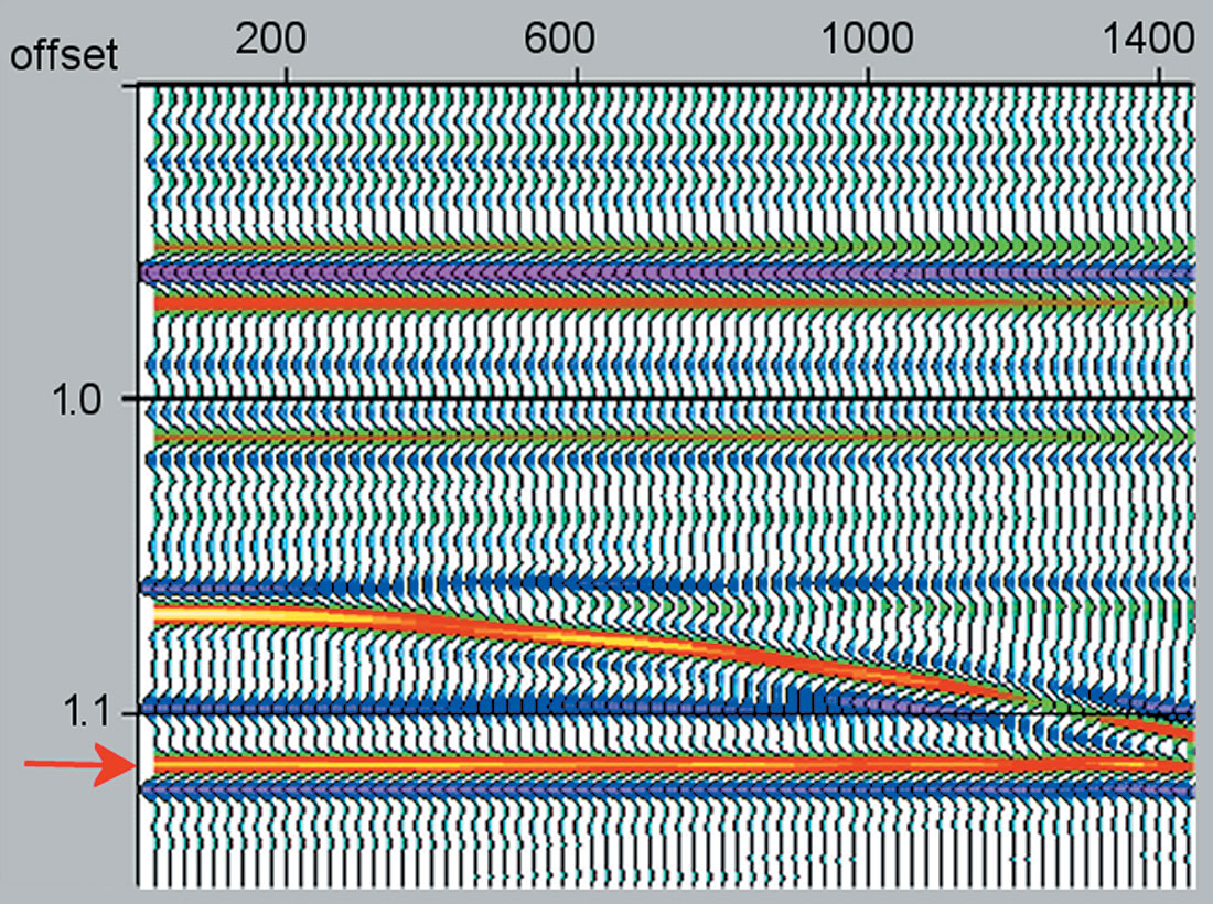
Consider an example where our data consists of amplitudes of a reflection event in a cmp gather. Figure 1 shows a synthetic gather with 70 discrete offsets and a corresponding plot of the amplitude values at a constant time sample. Most of the amplitudes are around +0.030, but there is some scatter in the values. If we want to have one value that can represent the ‘central tendency’ of the reflection at this time sample, we could use the mean. In practice, this is what cmp stacking is: the mean of the values at a particular time sample (Figure 2).
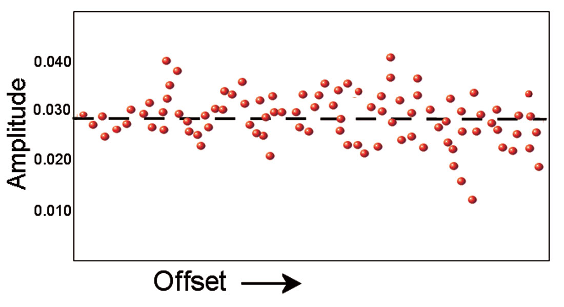
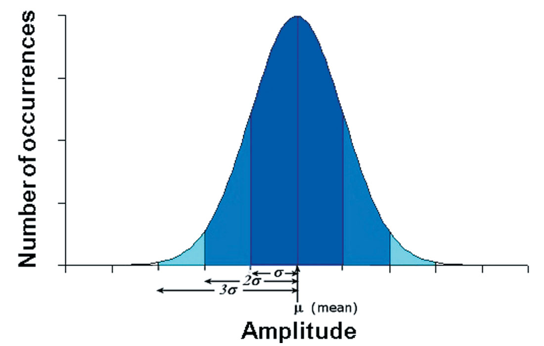
How well does the stacked trace amplitude represent the data? Is there a lot of scatter in the data? To answer such questions, we can examine the standard deviation. If we plot the variable under consideration (amplitude, in this example) on the x-axis, and the number of occurrences (the number of times a particular measurement occurs) on the y-axis, we see a normal distribution: a bell-shaped curve centred on the mean (Figure 3). Most of the amplitudes are close to the mean, with few occurrences of the extremes of very weak or very strong amplitude. When the values a re tightly bunched together, the standard deviation is small and the bell curve is steep. When the values vary more widely, the standard deviation is large and the bell curve is broader.
With this example, it is important to remember that stacking makes the assumption that, as far as reflectivity is concerned, all offsets are equivalent and it is valid to simply average what was recorded at all offsets. We say the stack represents zero-offset reflectivity, but when you think about it, the assumption means that the stack represents any-offset reflectivity. We know, from Zoeppritz’s equations, however, that reflectivity does in fact vary with angle (offset can be mapped to angle). Linear approximations to Zoeppritz’s equations are commonly used in quantitative AVO analysis. These can be considered as similar to stacking (Figure 2) except now the x-axis is sin2θ and instead of a flat line, the line has a slope and intercept. The concepts of variance and standard deviation can be used whether we are stacking or using a sloping line from a linear AVO equation: some points will be above the line and some below, and we can do statistical analysis to tell us how widely the points are distributed and how well the solution represents the data.
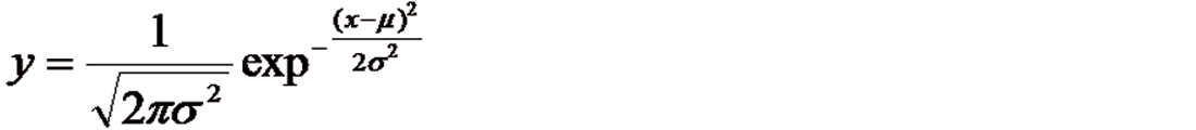
The equation for the normal curve is given in Appendix A. It is important to note that once the mean and standard deviation are computed for a normally distributed random variable, the normal curve is completely determined. The equation of the curve is such that the total area under the curve is always equal to 1. This is significant because the area under the curve tells us about pro b ability. Consider probability as a number on a scale of 0 to 1 indicating the likelihood of something – amplitude of a reflection, for instance – occurring. In this way, a normal distribution is a statistical model that can be used to compute the probability of a predicted value.
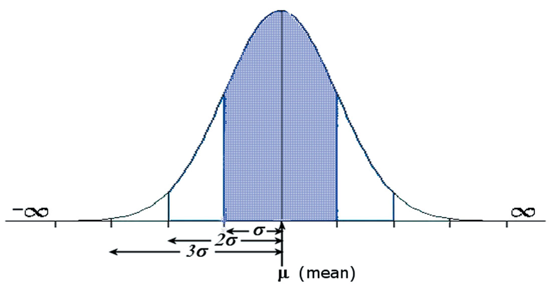
It is also important to note that in every normal distribution, about two-thirds of the things being measured will be within one standard deviation of the mean. About 95 percent will be within two standard deviations, and 99.5 percent within three.
To compute the mean, sum the values and divide by the number of values. Then to compute the standard deviation, remember that each data point deviates somewhat from the mean; take the average of all the squared deviations. The standard deviation is the square root of this. In this example the mean amplitude is +0.029 with a standard deviation of 0.004. The dark blue area in Figure 3 is the mean plus or minus one standard deviation (+0.029 +/- 0.004, in other words: amplitudes of +0.025 to +0.033). This area is 68 percent of the total area under the curve. There is a probability of 0.68 that any particular measurement will be within this range. Similarly, since 95 percent of the measurements are within two standard deviations of the mean (+0.029 +/- 0.008, or +0.021 to +0.037), there is a probability of 0.95 that any particular measurement will be in this range. Another way of saying this is that the amplitude of this reflection is 0.029 +/- 0.008, 19 times out of 20.
A normal curve is useful for predicting the likelihood of a value occurring when we have incomplete observations. For example, predicting the amplitude at an offset we did not actually record in our gather. A helpful analogy is from the social sciences, where pollsters measure a small sample of the electors to predict the likelihood of how the whole electorate will vote. Is it valid to generalize the standard deviation we have computed on our few offsets out to the larger population of all possible offsets? Whenever we are using a small sample to predict the larger population, there is some uncertainty but we can quantify the uncertainty of our prediction. George Gallup said that one spoonful of soup can accurately represent the taste of the whole pot, so long as everything is well stirred.
If the data have a normal distribution, and if we have taken only three measurements (amplitudes at three offsets, in our example), we would not be very confident in generalizing our statistics to predict a value. If we have taken 200 measurements, our confidence is increased. The margin of error associated with any sample size can be determined roughly as 1∕√n. [Typically samples of 1000 give results with a 3 percent margin of error: 1∕√1000 = 0.03. There is, however a diminishing return . Increasing the sample size to 10,000 only reduces the margin of error to roughly 1 percent, which is often not worth the added expense. This is why the published poll results you often see are from surveys of around 1000 people.]
Managing Error (Telling Time with Two Watches)
What’s the difference between a geophysicist and a statistician? The geophysicist wants to know the data fits the interpretational model; the statistician wants to know about the misfit.
Geophysicists can benefit from incorporating statistical attributes describing error into their interpretation, particularly when interpreting quantitative AVO results. Don’t look just at the AVO attribute, whether it is Intercept, Gradient, Fluid Stack or P-, S-, or Density-Reflectivity or whatever. Look also at statistical attributes associated with these AVO attributes.
One of the simplest and most useful attributes is Instantaneous Amplitude Range. This is a measurement of the range of amplitudes input to the AVO calculation at each time sample. An anomalously large range in amplitude indicates possible noise bursts. The Instantaneous Amplitude Range is a QC section for quickly identifying gathers requiring further trace edits. Similar ‘range’ type of attributes include Instantaneous Average Offset, a measurement of the average offset input to the AVO solution at each time sample. This QC is useful to check that any bright or dim spots apparent on the cmp stack are not attributable to the geometry of the recorded data, such as over-representation of far offsets, for example. Instantaneous Fold is useful to check that any bright or dim spots apparent on the cmp stack do not correspond to irregularities in fold.
Standard Deviation is a statistical error attribute that can be quite useful. Standard Deviation addresses data misfit: how well does the observed data fit the AVO equation? It indicates the typical size of deviations from the AVO model. The smallest possible value for Standard Deviation is zero, meaning the data fits the AVO equation perfectly. Large values indicate more scatter in the data.
C o r relation Coefficient is a statistical error attribute that addresses theoretical misfit; the error arising from shortcomings of the theory. This attribute is useful to answer questions such as, “Is this AVO equation the right curve to use?”, or, “Are the assumptions made by the AVO equation valid here?” The Correlation Coefficient is the ratio of the variation in the gather left after AVO to the variation in the gather left after stacking. It always has a value between zero and one. Zero means that the data can be completely represented by stacking. One means that the AVO curve has completely explained the data. It is a way of testing whether AVO adds any value over cmp stacking.
The 90% Confidence Gradient is a statistical attribute indicating areas within the volume where the AVO solution is reliable. It often indicates areas with poor signal-to-noise ratio and can be used to determine an optimum super-bin size for the AVO extraction. It can also be helpful for presenting AVO results to managers who may not have specific training in geophysics.
Other statistical attributes such as Walden’s Runs Statistic (local variations in Runs Statistic may indicate coherent noise, residual NMO, or critical angle effects may be affecting the AVO solution), Maximum Value of Leverage (are outliers potentially unduly influencing the AVO solution), Maximum Value of Residual (red flag if Residuals tend to track any AVO anomalies), and Cook’s Distance Maximum (a combination of leverage and residuals that can indicate bias in the AVO fitting) can also be computed and assessed.
In earlier times, they had no statistics, and so they had to fall back on lies. ~ Stephen Leacock
In summary, statistical attributes can be very useful in interpreting seismic data. Remember that a stack is a mean and so is only a measure of the central tendency. Standard deviation will give you an idea of the width of that distribution. Although zones where the pre- stack data are noisy (the distribution about the mean is wide) will usually also be self-evidently noisy on the stack, this is not always the case, especially if there has been some post-stack signal-to-noise enhancement. Standard deviation can flag these zones as less reliable.
And when evaluating AVO attributes, we ought to examine quantified answers to questions such as: How well does the data fit the AVO equation? How confident can we be in the solution? Are there zones in the survey where the misfit is large? Can we flag such areas for further investigation as to the causes of misfit (misfit caused by noise, or local errors in angle calculations, for instance). Geophysicists can benefit from incorporating error attributes such as standard deviation and other error attributes into their interpretation of quantitative AVO results. This practice is gaining popularity and helps interpreters to identify, rank, and manage areas of uncertainty.

Acknowledgements
I wish to thank Mike Burianyk, Dave Gray, and Nancy Shaw who all gladly offered helpful comments. Any errors or mis-statements remain entirely my own.


Join the Conversation
Interested in starting, or contributing to a conversation about an article or issue of the RECORDER? Join our CSEG LinkedIn Group.
Share This Article